Showing posts with label fashion. Show all posts

Tuesday, September 6, 2016

Pantone Fall 2016 Fashion Colors

The Pantone Color Institute says that the new fall fashion colors were inspired from "the desire for tranquility, strength and optimism".  While some of this fall seasons shades are deep earth tones, some of the colors are quite vibrant.  Several of these colors we have seen before where others are new.


I apologize for getting the new color recipes out to you a little late  but they are now finally ready!  I haven't had time to play with all of the colors yet but hope to more this week.


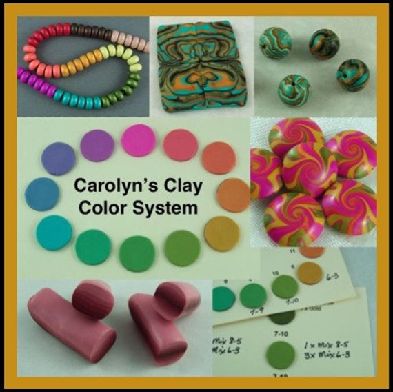
After sharing all the color recipes with you, I will provide the recipe cards to download again so you can add them to your Clay Color System Library Collection.

Tuesday, August 12, 2014

Polymer Clay Recipes for the Pantone Fall 2014 Fashion Colors

Here is the summary for all the polymer clay recipes for the Pantone Fall 2014 Fashion Colors.


Click on each of the photos below to see the clay recipes using Kato clay.


Saturday, May 17, 2014

Photo shoot photos done

We received the photos from our photo shoot and finally found some time to post them on our website.  I am still trying to figure out a way to embed a slide show so will do that later.  Colin MacArthur is a wonderful photographer and was a real pleasure working with him.  We couldn't have found a better model than Tiffany and the three of us had a really fun time that day.

Here are a few of our favorite photos.  You can see more scattered throughout our website, particularly in our jewelry and scarf accents sections.

Desert Reflection

Emerald Forest

"Turquoise" Collection

Country Garden

Medieval Medallion

Soft Elegance Scarf Necklace, Medallion Shawl/Hair Pin

Soft Elegance Scarf Necklace, Spiral Bracelet

Tuesday, January 21, 2014

Mixing it Up

It is always fun to see what others are doing with the new Pantone color recipes I shared earlier.  These are some fun cane pieces on Wendy Moore's clay table in Dazzling Blue, Cayenne, Celosia Orange, and Freesia.  She added some turquoise which I think makes a great addition to the mix.  Wendy does some fabulous work and is planning on making some necklaces with these pieces so I can't wait to see what she creates!

Clay pieces by Wendy Moore
Check out her blog and see her fun "bodacious babes" she has been making.  Enter her "Word of the Year" challenge and you could receive one of  her amply endowed Annies.

Saturday, January 11, 2014

Summary for the Polymer Clay Recipes for the Pantone Spring 2014 Fashion Colors

So I hope you enjoyed mixing up some new colors for the new year.  Here is a summary of all ten of the Pantone Spring 2014 Fashion Colors.


Just click on each picture below to see the color recipe using Kato polyclay.  You can see my other clay recipes for Pantone colors from past seasons on the "Polymer Clay Color Recipes & Tips" page link at the top of this blog.

Just a note here.  I have been asked many times if I recreate these color recipes in other clay brands such as Premo.  We use to use Premo clay some time ago but have since then switched and use pretty much only the Kato brand now.  Some time ago, I wrote a blog post explaining why we switched and you can read it here.


Friday, August 30, 2013

Pantone Fall 2013 Fashion Colors Turbulence and Carafe

Here are the last two clay recipes for the Pantone Fall 2013 colors Turbulence and Carafe.  While I consider these two colors more as "neutrals" rather than actual colors, they can be used as an accent with many of the other Pantone Fall shades.  I do like how they combine to give the classic look found in this Pantone sketch.
When we are creating with our clay, we do not have to limit ourselves to the clay mixture itself to obtain the Pantone colors that are in season.  For instance, inks, paints or mica powders can be applied to the clay to achieve the same results.  This button for instance is a combination of pearl and antique copper mica powders applied to black clay that was textured, resulting in a very close match to the shades of Turbulence and Carafe.


Here are the clay color recipes using Kato clay:

Turbulence

1 part Charcoal Mix #1-9 *
1 part White Mix #1-2 *

Carafe

6 parts Burnt Umber Mix #3-2 *
1 part Kato Black
1/2 part Kato Gold

*Note: These base color mixes are found in my Clay Color System Tutorial.


Just a reminder that my Clay Color System Tutorial is still on sale for half price until tomorrow (Saturday night).  Even if you do not use Kato clay, my color system is more than just color recipes. It is all about mixing up colors as well as creating blends and then a simple method for keeping it all organized.

Thursday, August 29, 2013

Pantone Fall 2013 Fashion Color Samba

The Pantone color Samba is a rich and very vibrant shade of red.  Years ago we have never found jewelry pieces in red to be big sellers.  We have noticed, however, that over the past 2 years, red has gained more popularity and now almost any item we create in red sells and we get more requests for items in red than ever before.


Combining red with black can be very dramatic.  Here are two scarf clips created with the Samba red. The one on the left is red on a black background using the "sutton slice" technique and the one on the right is charcoal mica powder on the Samba red textured clay.


Here is the clay color recipe using Kato clay:

Samba

3 parts Kato Red
1 part Kato Magenta


Monday, August 26, 2013

Pantone Fall 2013 Fashion Color Koi

The Pantone fall 2013 color Koi is a deep orange similar to the color of goldfish in a pond.  When selling our jewelry we have found orange to be a color that people are either not crazy about or just love.   I generally like to use orange within a design as opposed to a stand alone color.
When we make our flowers, however, it is another story as we find it is one of our top sellers. These flower beads were made using the Pantone color Koi combined with the two yellow greens, Linden and Deep Lichen.


Here is the color recipe using Kato clay:

Koi

6 parts Kato Orange
1 part Kato Red
1 part Kato Gold
2 parts White Mix #1-2 *

*Note: This base color mix is found in my Clay Color System Tutorial.

Sunday, August 25, 2013

Pantone Fall 2013 Fashion Colors Deep Lichen Green and Linden Green

Shades of olive or lime are my absolute favorites and the color I look best in as I've been told they bring out the green in my eyes.  Two of the Pantone Fall 2013 colors are Deep Lichen Green which has a rich mossy tone and Linden Green, a yellow green that (as described by Pantone) "brings a lightness and brightness to the deeper shades of fall".


I find these two greens compliment each other quite nicely as you can see in these "leaf beads" I made from a skinner blend of the two to use in our fall jewelry designs.


Here are the clay recipes for these two greens using Kato clay:

Deep Lichen Green

2 parts Kato Turquoise
1 part Kato Gold
1 part Black Mix #1-8 *

Linden Green

10 parts Kato Yellow
1/2 part Kato Green
1/2 part Kato Gold
4 parts White Mix #1-2 *

*Note: The recipe for these base mixes are found in my Clay Color System Tutorial.

Friday, August 23, 2013

Pantone Fall 2013 Fashion Colors Acai and Vivacious

I thought I would start you off with clay recipes for two of the new Pantone Fall 2013 fashion colors, Acai, a deep purple and Vivacious, a rich fuchsia or magenta.  The two colors go really well together so make a great combination in the clay.  Purple is one of those colors that does not look good on me, no matter what shade.  I have learned, however, that when you are making jewelry and other accessories to sell, you need to consider the buyer and so we include this color in our work more as there are many purple lovers out there.
This is a bargello style scarf clip in the Acai and Vivacious color combo.


And here are the recipes for these two colors using Kato clay:

Acai
5 parts Mix #10-2 *
1 part Kato Silver

Vivacious:
10 parts Kato Magenta
1 part Kato Red
1 part White Mix #1-2*

*Note: These base color mixes are found in my Clay Color System Tutorial.

Thursday, September 13, 2012

Pantone 2012 Color Honey Gold and Hooked on Polyvore


The last Pantone fall 2012 fashion clay color recipe I have to share with you is Honey Gold.  This rich golden yellow is a slightly muted version of a previous Pantone color called Golden Glow which I have used as my base color.


Honey Gold
4 parts Golden Glow (see recipe # 6-6) *
1 part Ecru Mix (see recipe # 2-8) *

* These base mix recipes are found in my Clay Color System tutorial.

I don't have any clay pieces to show you yet as I have been busy working on filling bead and button orders.  I do have this collage I created on Polyvore some time ago, however, combining the Honey Gold with French Roast. I came across various Polyvore collages on Pinterest so decided to check it out for myself the other day and once I started playing around I was hooked!  It was rather fun and but also addicting and reminded me of my early years playing with paper dolls.  It is a fun way to combine various colors and textures.  You will find more collages and Pantone color inspirations on my Pinterest board.


And here is a summary of all the clay recipes for the


Click on the color names below
to go to the posts with those recipes:


Honey Gold
(see above in this post)