Thursday, September 1, 2022

Pantone Fall 2022 Core Classics

Pantone has added five more colors to their fall/winter palette which they call their "Core Classics".  They are types of neutrals and can be combined with any of the main fall/winter colors.

Pantone Core Classic Colors:
Loden Frost, Autumn Blonde
Arctic Wolf, Polar Night, Chiseled Stone 

Artic Wolf, Polar Night and Chiseled Stone are just your basic colors, white, black and grey, respectively.  Artic Wolf is actually more of an off white.  I have to say that is one of my main dislikes with Kato clay is that their white is not really pure white but more of an off white and wondering if anyone else has noticed this?  Just hold the block of clay next to a white from any other brand of clay and you will see what I mean.  And not only is it not that white to begin with, it is notorious for discoloring even more after baking!  Donna Kato had publicly shared how she bakes her transluscent pieces in a pan of baking soda (completely cover the item) to prevent darkening or discoloring.  I do the same for my whites as well.

I actually bake this way with a lot of my clay beads and larger items for another reason -- to prevent them from actually cracking!  I use to get a lot of pieces with surface cracks until I started baking my pieces this way.  Just a quick note:  I know many have confused baking soda with cornstarch.  I do NOT recommend cornstarch to be used this way.  After baking, the baking soda will wash right off where cornstarch will not and actually get embedded into the clay.  Cornstarch works best only as a mold release when water isn't suitable.

Anyhow, I felt it was futile to mix up more shades of white, black and grey but will share recipes for Loden Frost and Autumn Blonde.  Loden Frost is a very soft and muted shade of green.  For Autumn Blonde, the color "Linen" is a close match which could be used instead.  This color was in the Pantone Spring 2013 palette and you will find the clay recipe here.

Here are the two color recipes using Kato clay:

Loden Frost
2 parts Cilantro #7-3 *
1 part Ecru Base # 2-7 *

Autumn Blonde  (Linen)
14 parts Kato Beige
1 part Ecru Mix # 2-8 *
1 part White Mix # 1-2 *

*Note: These base color mixes are found in my Clay Color System tutorial

Tuesday, August 30, 2022

Pantone Fall Colors Caramel Cafe, Midnight & Martini Olive

Here are three more clay recipes I want to share with you from the Pantone fall 2022 fashion color collection:  Caramel Cafe, Midnight and Martini Olive.

Caramel Cafe is a soft and warm shade of brown that definitely reminds me of autumn. I am also seeing a lot of animal prints in the stores going into fall.  I generally do most of my animal prints with "canes" that I create myself but I happened to have this silk screen from Tonja and so thought I would try it out.  There are six different style prints on one silkscreen so I decided to experiment with three different clay colors and screen print all at the same time.  I lined up the Caramel Cafe for a Leopard print, a white for the zebra and a grey for the snake.


I then screen printed all three colors at the same time in black and this is the result.  So now I need to decide what I will create with it.

Midnight is a dark blue similar to denim.  In fact I have used this exact blue recipe to create some of my faux denim pieces.  In order to do this, all you need is actual denim fabric to use as your texture!  I just create a thick sheet of smooth clay, spray the denim fabric and clay with water as a mold release and then run it through the pasta machine together on a thinner setting.  (Tip: this does not work with Fimo clay as fimo reacts badly to water and will become really wierd and gummy so best to do this with any other type of clay).


By the way, the Midnight blue clay shown above here looks a bit lighter but that is because it will darken after it is baked.  In fact many of the Kato clay colors will change slightly after baking and so when I first create my recipes I generally allow for this factor and the final color match test is after it is baked.

So here are some denim snaps and earrings I have created using this exact blue color.  After texturing, I create my pieces and bake.  After baking I will rub in white acrylic paint (make sure it is acrylic or compatible with the clay) and then rub off any excess until I get the look that I want.  I will then bake again to make the paint adhere to the clay more.


Martini Olive is a rich olive green and slightly darker than the Olive green in my Clay Color System.  It is also one of my favorite colors I like to wear and create with.  It combines well with so many colors and is more of a shade of green for fall rather than spring or summer.  Here are some finished pieces that I created using the same olive green combined with other colors that might not be specific to this falls Pantone color palette but are very similar:


So here are the three color recipes using Kato clay:

Caramel Cafe
4 parts Kato Brown
1/2 part Ecru Base # 2-7 *

Midnight
3 parts Navy Blue # 9-7 *
1 part Kato Pearl

Martini Olive
Follow clay recipe for Olive Green # 7-8 *
Add 1 part Kato Black

*Note: These base color mixes are found in my Clay Color System Tutorial.


Monday, August 29, 2022

Pantone Fall Colors Nosegay & Waterspout

The two Pantone fall colors Nosegay and Waterspout are much lighter and less intense than the other colors in this seasons pallet and have a very calming effect.

They may seem more like summer colors but combined with some other colors in the winter palette can really change the effect.

Nosegay with Midnight and Amazon

Waterspout with Caramel Cafe and Midnight

And here are the two colors that have a silkscreen pattern in black which creates a great contrast and dramatic effect.  Both silkscreens are new ones I am trying out that were created by Tina Holden which are available in her Beadcomber Etsy shop here.  I will show you how my pieces I am making with these clay sheets come out when they are finished.

When I researched the color Nosegay, I discovered that Sweet Lilac is a close match and was previously used in the Pantone fall 2012 color collection.  I will share the same recipe again here but you can also find it in my first original post in February 2012 for reference.

Nosegay is a close match to Sweet Lilac

Waterspout is a gorgeous turquoise-like shade that reminds me of the ocean waters surrounding a tropical island.

So here are the color recipes using Kato clay.

Nosegay (Sweet Lilac)
1 part Kato Magenta
15 parts White Mix # 1-2 *

Waterspout
1 part Kato Turquoise
1/4 part Kato Green
10 parts White Mix # 1-2 *

*Note: These base color mixes are found in my Clay Color System Tutorial.

Saturday, August 27, 2022

Pantone Colors Rose Violet & Amazon

Today I will be sharing two more clay recipes from the Pantone fall fashion color collection.  Rose Violet, as Pantone describes, "is vivid, vibrant and full of zing.  Amazon is a lush and fertile broadleaf green".

When I see these colors together I immediately think of tropical plants such as Hibiscus flowers and the large Monstera plant.  I textured a sheet of clay in the Amazon color here with Shades of Clay Monstera Love Texture Stamp.  It is thin enough to run through the pasta machine together with the sheet of clay to make a nice deep and even texture.  Now I have to decide what to create with this. 


The photo below shows Monstera leaves screen printed in black on the Amazon colored clay.  These will make nice earrings once they are cut out and finished off.  I will share my finished results later.

"Monstera Leaf" silkscreen by Tina Holden

While these designs are not Hibiscus flowers, they do have a fun look and I wanted to compare white vs black print.

"Mandala" and "Floral Tapestry" silkscreens by Tina Holden

These and the leaf print silkscreens, shown above, are created by Tina Holden and you can find them in her Etsy shop here.

I really love these two colors together and thinking some mokume gane patterns. I like to make large tiles in the Pantone colors so I can play with them and such as mixing and matching.  These tiles are about 1-1/2 inches in size.

So here are the color recipes using Kato clay.

Rose Violet
3 parts Kato Magenta
1/2 part Kato Violet
1 part White Mix # 1-2 *

Amazon
5 parts Kato Green
1/4 part Kato Black

*Note: These base color mixes are found in my Clay Color System Tutorial.

Thursday, August 25, 2022

Pantone Fall Fashion Colors Lava Falls, Samoan Sun & Orange Tiger

The Pantone fashion colors for this fall are very rich and vibrant.  Pantone describes them as "Contrasting colors that bring together our co-existing desires for rest and relaxation with exuberant expression".

I am going to start with the first three colors that to me are perfect fall colors, a rich red, deep yellow and autumn orange.

Two of these colors have been used in previous Pantone color collections.  Lava Falls isn't in my latest Pantone color swatches but Pantone tells me that the color Samba is a very close match.  Samba was in the Pantone Fall 2013 Fashion Color Collection.  

You can find links to all the clay recipes I shared here for the previous Pantone colors back as far as Spring 2011 if you click on the "Pantone Color Recipes" tab at the top of this blog.

The color Orange Tiger was previously used in the Pantone Fall 2019 Fashion Color Collection.  These orange flatback "hotfix" crystals are a perfect match to the Orange Tiger and are available in my online store.  They are made in Canada and the cut, clarity and color are absolutely incredible and I find them very comparable to the expensive and now hard to get Swarovski crystals. 

I will share the recipes here again but wanted to let you know in case you already added these colors to your "Clay Color System" recipe cards.

So here are the recipes for these three Pantone colors using Kato Poly clay:

Lava Falls (Samba)
3 parts Kato Red
1 part Kato Magenta

Samoan Sun
10 parts Kato Yellow
1/4 part Kato Gold
1/8 part Kato Orange
6 parts White Mix # 1-2 *

Orange Tiger
4 parts Kato Orange
1 part Kato Gold
4 parts Kato Yellow

* Note:  These clay color recipes are created using Kato clay.  Any of the base color "mixes" used are from my Clay Color System.  You can read more here why I use Kato clay when mixing up my Pantone colors and still my preferred clay type.


Friday, August 19, 2022

Storing and Organizing my Pantone Clay Colors

Fall is just around the bend and I am back to mixing up the seasonal colors for the latest Pantone palette.  The hardest thing I find with mixing up the new line of colors is that some of the current ones I am not quite ready to give up yet.  So I will add those favorites to my permanent collection in my "Clay Color System".  I have a unique way of storing my Pantone clay colors for each season.

I am normally not a fan or big shopper at the Michael's Store but I do like some of their storage containers and many of them are made in the type of plastic that is compatible with the clay (you have to test first to be sure).  In my studio I have these photo cases that I keep many of my "canes" or clay veneers organized.  You can buy them individually or the best deal is the case that contains 16 for a special price.  I have lots in the clear that works well for seeing what is inside easily but I also like the multi-colored ones (as in the photo shown above) so I can coordinate with my clay colors and find the ones I want quicker.

These photo boxes fit perfectly in the media storage shelf that I have next to my clay mixing table.  Each season I add the latest Pantone colors to the photo boxes and arrange them on my shelf so they are handy.  You can see the latest fall colors here which I will be sharing the recipes for very soon!  I also like to keep my favorite colors from previous seasons there as well along with colors I use the most, including my base mixes. 


I generally like to use these containers to keep any prepared clay veneers or pieces for later use.  I cut up acetate sheets (same sheets used for laminating) in 4"x6" rectangles so I can stack several layers inside a box.  The circles below, for instance are ready to use for my interchangeable snaps or as earrings.


Of course I do not keep all my clay color recipes in these boxes as that would require hundreds! But they are great when I mix up large batches of my favorite colors and such.  And if you do not have shelf space to keep them, you can always use the storage case that they come in as well.
So I will be sharing the Pantone Fall Fashion Colors with you in the next day or so.  If you want a head start, here is a clue:  Check out the labels on the cases that show the 10 colors in the photo above.  Two of the colors are close matches to colors used in previous Pantone palettes.  Just do a search in the bar of this blog to find them.

Friday, July 29, 2022

New Items in our Serveware Collection

Most everyone that knows me first connects me to making jewelry and second to making buttons.  While I do make those the most, I also enjoy creating in a different dimension and with larger items and so also have, what I call, my "Serveware Collection".  I haven't been able to list any of these in our online store as of yet since they seem to sell before I get the chance.  Hopefully I will be able to have some listed in time for Christmas this year.

Art Deco Serveware

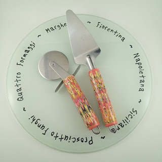
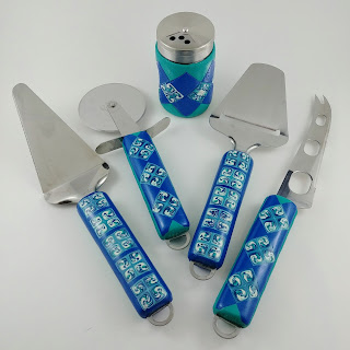
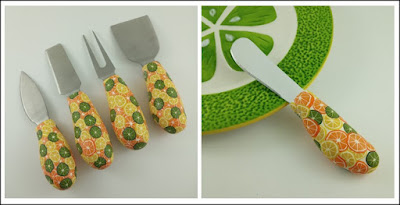
I collect an assortment of stainless steel serving items that would work really well with the clay such as cheese knives, pizza cutters and other utensils.  Here are a few new items I recently created and are now for sale at the Shuswap Artisan Market in Sorrento, BC, Canada.

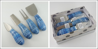
Cheese Knives - Blue

Cheese Knives - Citrus

Pizza Servers

Pizza Servers

There are quite a few more designs at the market, however I just wanted to share a few samples for now.  These take quite a bit more work and time to create than the smaller jewelry items but the finished product in the end is very satisfying!

Wednesday, June 8, 2022

New Buttons & Bags for Fibre Expressions

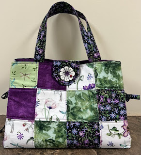
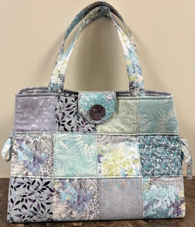
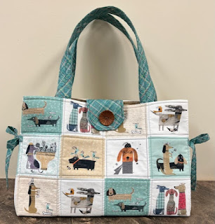
Fibre Expressions is a quilt shop on the Sunshine Coast of BC in the town of Sechelt.  They sell a wide range of our handcrafted buttons but what is unique is how they create bag designs in which our buttons are incorporated.  They are put into kits which makes it more efficient when purchasing the correct amount of each fabric for the project.


They will be selling these kits, along with other goodies at the Quilt Canada show which happens to be coming up already next week in Vancouver.  Of course if you cannot make it to the show and looking to order some of their items, they can be purchased in their online store.

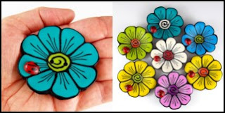
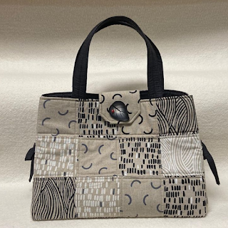
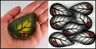
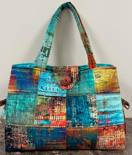
Here are a few samples of the bags they created and a close-up sample of the buttons used:


Gigantic Blooms


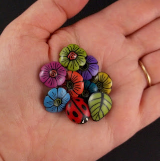
Leaves with Lady Bug


Celtic Heart


Brocade


Color Wheel


Exotica

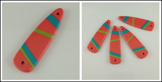
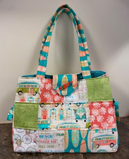
And finally, I created these special Surfboards as an accent button for a beach bag design of theirs.

Surfboards

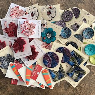
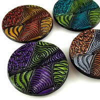
We also have our handcrafted buttons listed in our own online store here.  We have everything from real tiny that are suitable for children's wear or knit/crochet projects to very large as shown above.

Mini Blooms

Some of our buttons might not be listed in our store if we are out of stock so you can contact us (through our website) with your request or any questions.