Friday, August 30, 2013

Pantone Fall 2013 Fashion Colors Turbulence and Carafe

Here are the last two clay recipes for the Pantone Fall 2013 colors Turbulence and Carafe.  While I consider these two colors more as "neutrals" rather than actual colors, they can be used as an accent with many of the other Pantone Fall shades.  I do like how they combine to give the classic look found in this Pantone sketch.
When we are creating with our clay, we do not have to limit ourselves to the clay mixture itself to obtain the Pantone colors that are in season.  For instance, inks, paints or mica powders can be applied to the clay to achieve the same results.  This button for instance is a combination of pearl and antique copper mica powders applied to black clay that was textured, resulting in a very close match to the shades of Turbulence and Carafe.


Here are the clay color recipes using Kato clay:

Turbulence

1 part Charcoal Mix #1-9 *
1 part White Mix #1-2 *

Carafe

6 parts Burnt Umber Mix #3-2 *
1 part Kato Black
1/2 part Kato Gold

*Note: These base color mixes are found in my Clay Color System Tutorial.


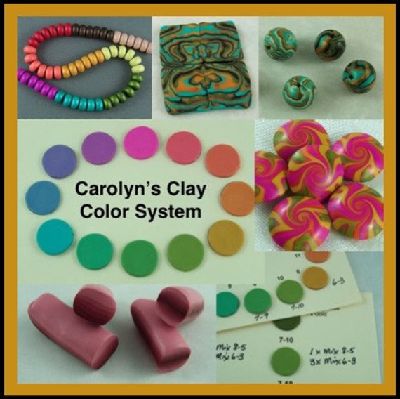
Just a reminder that my Clay Color System Tutorial is still on sale for half price until tomorrow (Saturday night).  Even if you do not use Kato clay, my color system is more than just color recipes. It is all about mixing up colors as well as creating blends and then a simple method for keeping it all organized.

Thursday, August 29, 2013

Pantone Fall 2013 Fashion Color Samba

The Pantone color Samba is a rich and very vibrant shade of red.  Years ago we have never found jewelry pieces in red to be big sellers.  We have noticed, however, that over the past 2 years, red has gained more popularity and now almost any item we create in red sells and we get more requests for items in red than ever before.


Combining red with black can be very dramatic.  Here are two scarf clips created with the Samba red. The one on the left is red on a black background using the "sutton slice" technique and the one on the right is charcoal mica powder on the Samba red textured clay.


Here is the clay color recipe using Kato clay:

Samba

3 parts Kato Red
1 part Kato Magenta


Tuesday, August 27, 2013

Pantone Fall 2013 Fashion Color Mykonos Blue

I love the rich shade of the Mykonos Blue that has a deep teal undertone and is named after the beautiful waters surrounding the Greek Island.

I am imagining this color combined with several other Pantone Fall colors like Acai or Linden Green.
Here are a few floral shawl/hair sticks in this lovely shade of blue.


And the recipe for Mykonos Blue using Kato clay:

Mykonos Blue

2 parts Kato Ultra Blue
2 parts Kato Turquoise
1 part Kato Green
1 part Kato Pearl (optional)

Note:  The pearl in this recipe is optional but I find it adds that little bit of shimmer making the color appear richer.


Monday, August 26, 2013

Pantone Fall 2013 Fashion Color Koi

The Pantone fall 2013 color Koi is a deep orange similar to the color of goldfish in a pond.  When selling our jewelry we have found orange to be a color that people are either not crazy about or just love.   I generally like to use orange within a design as opposed to a stand alone color.
When we make our flowers, however, it is another story as we find it is one of our top sellers. These flower beads were made using the Pantone color Koi combined with the two yellow greens, Linden and Deep Lichen.


Here is the color recipe using Kato clay:

Koi

6 parts Kato Orange
1 part Kato Red
1 part Kato Gold
2 parts White Mix #1-2 *

*Note: This base color mix is found in my Clay Color System Tutorial.

Sunday, August 25, 2013

Pantone Fall 2013 Fashion Colors and Carolyn's Clay Color System

I've gained a lot more followers over the past few years since I first introduced my Clay Color System and I realize many of you might not be familiar.  As a continuation of my tutorial, I have been sharing with you my color recipes for the Spring and Fall Pantone Fashion Reports using Kato clay.  You can see links to past color recipes I have posted on the above tab of this blog, titled, "Polymer clay color recipes & tips".

My Clay Color System is a simple method to learn how to mix and combine color as well as organizing those color samples and even your clay.  It includes over 50 of my own color recipes, some of which are "base mixes" for creating shades or tints to get you started on your way to creating new colors of your own.


You can purchase my tutorial as an instant download in our Etsy Shop.

or in our online store -- (you will have to wait for it to be e-mailed to you).

Pantone Fall 2013 Fashion Colors Deep Lichen Green and Linden Green

Shades of olive or lime are my absolute favorites and the color I look best in as I've been told they bring out the green in my eyes.  Two of the Pantone Fall 2013 colors are Deep Lichen Green which has a rich mossy tone and Linden Green, a yellow green that (as described by Pantone) "brings a lightness and brightness to the deeper shades of fall".


I find these two greens compliment each other quite nicely as you can see in these "leaf beads" I made from a skinner blend of the two to use in our fall jewelry designs.


Here are the clay recipes for these two greens using Kato clay:

Deep Lichen Green

2 parts Kato Turquoise
1 part Kato Gold
1 part Black Mix #1-8 *

Linden Green

10 parts Kato Yellow
1/2 part Kato Green
1/2 part Kato Gold
4 parts White Mix #1-2 *

*Note: The recipe for these base mixes are found in my Clay Color System Tutorial.

Friday, August 23, 2013

Pantone Fall 2013 Fashion Colors Acai and Vivacious

I thought I would start you off with clay recipes for two of the new Pantone Fall 2013 fashion colors, Acai, a deep purple and Vivacious, a rich fuchsia or magenta.  The two colors go really well together so make a great combination in the clay.  Purple is one of those colors that does not look good on me, no matter what shade.  I have learned, however, that when you are making jewelry and other accessories to sell, you need to consider the buyer and so we include this color in our work more as there are many purple lovers out there.
This is a bargello style scarf clip in the Acai and Vivacious color combo.


And here are the recipes for these two colors using Kato clay:

Acai
5 parts Mix #10-2 *
1 part Kato Silver

Vivacious:
10 parts Kato Magenta
1 part Kato Red
1 part White Mix #1-2*

*Note: These base color mixes are found in my Clay Color System Tutorial.