Friday, October 6, 2023

Pantone Fall 2023 Fashion Colors Persian Jewel, Tender Peach & Doe

I will be sharing the clay recipes for the last three Pantone Fall 2023 fashion colors, Persian Jewel, Tender Peach and Doe.  Doe is a actually one of the Classic Neutrals that I decided to include.

Persian Jewel is a gorgeous blue with a hint of violet yet slightly muted.  Pantone says it is inspired by the precious stone, lapis lazuli.  I really love this color and find it to be very calming.  I would love to have a top or outfit in this color but might just settle for some new clay jewelry instead!

Tender Peach is a soft yet peachy beige with a slight pink flesh undertone.  I think it would combine well with the Persian Jewel or even the Burnt Sienna.  I will have to experiment and see.

Doe is a soft brown with a rich gold undertone and perfect for fall.  It definitely is a great Classic Neutral and thinking animal prints.


Persian Jewel
2 parts Ultramarine #9-2 *
1 part Kato Silver
1/4 part Kato Violet
3 parts White Mix #1-2 *

Tender Peach
8 parts Kato Beige
1 part White Mix #1-2 *

Doe
4 parts Kato Gold
2 parts Kato Silver
4 parts Ecru Mix #2-8 *

* Note: These base color mixes are found in my Clay Color System Tutorial

I haven't had the time to play with these color yet as I am working on my new revised edition to my Clay Color System.  So far I am on schedule to have it published next week.

It is Thanksgiving weekend here in Canada so to all fellow Canadians, Happy Thanksgiving!

Thursday, October 5, 2023

Pantone Fall 2023 Fashion Colors Carnival Glass, Kohlrabi, and High Visibility

The Pantone Fall 2023 fashion colors include two shades of green -- one is a mint and the other a more yellow green.

Carnival Glass is the minty shade of green and does have, as Pantone describes, an icy appearance.  While this shade of green is particularly not my favorite, it could look nice when combined with another color such as navy blue.  I will have to experiment and see what I can come up with.

Kohlrabi is a warmer green and while similar to the brighter color, Love Bird, from this year's spring collection, it is slightly muted with a gold undertone.  This is my favorite shade of green that I always tend to be drawn to and can't seem to resist.

High Visibility is a very close match to Empire Yellow, which was also one of this year's spring palette.  It is also very similar to the yellow, Meadowlark, used in the Spring 2018 Pantone collection.  There might be a slight difference between each of these yellows, but it is so slight, one can hardly notice.  It is also on Pantone's list for a "close match" so this is why I chose to use the same color recipe again for this fall.


The only items I have made with the Pantone Fall colors for this year so far are a few of my little textured buttons.  Here are some in the High Visibility (Meadowlark) and Kohlrabi.  These, along with a wide assortment of other colors are available at the Kelowna Yarn & Needlecrafts store.


So here are the recipes for these three colors using Kato clay:

Carnival Glass
2 parts Kato Green
1/2 part Cilantro # 7-3 *
10 parts White Mix # 1-2 *

Kohlrabi
10 parts Kato Yellow
1-1/2 parts Kato Green
1/2 part Kato Gold
3 parts White Mix # 1-2 *

High Visibility

* Note: These base color mixes are found in my Clay Color System Tutorial 

Wednesday, October 4, 2023

Pantone Fall 2023 Fashion Colors Red Dahlia, Red Orange, Burnt Sienna & Rose Violet

While most of the Pantone Fall Fashion colors for 2023-2024 tend to be somewhat bright they all still have slight earthy undertones.

Besides Viva Magenta, there are 4 other colors in the red or magenta specter.  I will share the clay recipes for these with you today.

Red Dahlia is a rich wine red and is a very close match to the Pantone Fall 2019 color Chili Pepper so I am using the exact same recipe again.  This clay color may appear light after mixing but you will find it to become darker after it is baked.  That is one of things I noticed with using Kato Brand Clay, especially when working with red, magenta and sometimes violet if added as an ingredient. I have learned to make an allowance for this when mixing my colors.  I am currently working out some of these recipes with other clay brands, particularly Cernit, to see if I get the same results.


Red Orange is not exactly as it sounds.  It is in fact a more orange shade of red as compared to the swatch shown on a computer screen.  

Burnt Sienna is an earthy rust red that reminds me of autumn leaves.


Rose Violet was a Pantone Fashion color from last year - Fall 2022 - 2023.  It is gorgeous fuchsia and combines quite nicely with this years fall palette.  


Here are some pieces I made with the Rose Violet last fall that I screen printed in white.

Interchangeable Earring Beads in Rose Violet

Large interchangeable snap in Rose Violet

I still haven't had time to make much with these new colors yet but need to get cracking!  So in the meantime I will share these recipes with you so that you can start mixing them up as well.  So here are the four recipes using Kato Clay.
Red Dahlia
6 parts Kato Red
1/2 part Kato Violet

Red Orange
1 part Kato Orange
1/4 part Kato Red

Burnt Sienna
4 parts Kato Red
1 part Kato Magenta
1 part Kato Gold

Rose Violet
3 parts Kato Magenta
1/2 part Kato Violet
1 part White Mix # 1-2 *

* Note: These base color mixes are found in my Clay Color System Tutorial.

My Clay Color System tutorial is based on using Kato clay. If you like to work with other clays, (Cernit, Fimo Professional, Premo, etc.) my revised edition will be available very soon and I will have a special introductory sale price for it then -- (next week).  I will be announcing it here and on my facebook page when it is ready.

Friday, September 29, 2023

Stitch Markers in Viva Magenta

Wow!  Another fall is here, but with all the raging wildfires that surrounded us this past summer, I must say I am looking forward to cooler weather.  I did manage to work out the Pantone fall colors a while ago but didn't get a chance to post here yet as I was busy filling orders.  I am still dealing with some health issues so I do not get as much done in a day (or week) as I would like, but I am happy if I can at least get a few things accomplished.

I custom make "yarn ball" stitch markers (and holders) for Kelowna Yarn & Needlecrafts based on their store logo.

Yarn Ball Stitch Markers & Holder

Every year I create a batch of stitch markers in the Pantone Color of the Year for their Anniversary sale in September.  Here are the ones I made for this year in Viva Magenta.

Yarn Ball Stitch Markers in Viva Magenta

The stitch markers (and holders) are made exclusively for Kelowna Yarn and available at their store.

I haven't made anything else yet in the Viva Magenta Color but plan to shortly.  I already posted the color recipe with the Pantone Spring colors and you can click on the photo below to see it.

I will be posting the clay recipes for the Pantone fall colors over the next week.  The recipes are again in Kato Clay but may be my final ones I will be sharing.  I am currently working on a revised edition to my Clay Color System tutorial and for those of you who use other brands of clay, will find it to be a very useful tool.  I will share more over the week to give you a sneak peek.

Saturday, April 8, 2023

Summary for the Pantone Spring 2023 Fashion Color Recipes

Here is a review of the Pantone Spring 2023 Fashion Colors.  Click on the photos below to see the individual recipes.  You can access the past Pantone seasonal color recipes by clicking on the tab at the top of this blog.

Viva Magenta

Fiery Red / Beetroot Purple / Peach Pink / Crystal Rose / Vanilla Cream

Tangelo / Empire Yellow / Leek Green / Love Bird / Classic Green

Blue Perennial / Summer Song / Skylight / Macchiato / Gray Lilac

I hope you enjoy these new recipes.  I should have some examples and perhaps a new fun tutorial to share as well soon.

Friday, March 24, 2023

Pantone Spring 2023 Fashion Colors - Final Clay Recipes

The final five Pantone Spring 2023 Fashion Color recipes that I will be sharing are Blue Perennial, Summer Song, Skylight, Macchiato and Gray Lilac - shown from left to right in the samples below.


The illustration below shows where these colors are located on the color wheel.  You can see where Macchiato is a mix of orange and green (half way between - more or less), thus creating a shade of brown.  It is also on the opposite side of the color wheel to the two blue colors making them "complimentary".  Complimentary colors generally make a good contrast to each other and can also look good together.

Here are a few other illustrations combining these same five colors to see how they look on various color backgrounds and also as a gradient blend.

Gradient Blend

Mixing the different color backgrounds

Colors shown on a white vs. black background

I like to play with my Pantone app and create various color palettes to see how they look together.

I should mention that the Pantone color Skylight is a lighter version of the Pantone Spring 2022 color Blue Harbor.  Since it takes a fair amount of white to lighten, it is much easier to use a small amount of the Blue Harbor as the base rather than mixing the Skylight color from scratch.  If you already follow my Clay Color System and saved any left over clay in the color Harbor Blue, you already know how convenient this method is.  That is why my Color System tutorial is more than just color recipes.  It is a simple easy to understand way to mix and combine color but also how to organize your recipes and your clay colors that are mixed.

So here are the recipes for these five Pantone colors.  I hope you have fun with them and I would love to see any samples you come up with.  You can always share them on my facebook page.

BLUE PERENNIAL
2 parts Ultra Marine # 9-2 *
2 parts White Mix # 1-2 *
1 part Ecru Mix # 2-8 *

SUMMER SONG
2 parts Kato Blue
1/2 part Kato Turquoise
2 parts Kato Silver
2 parts Ecru Mix # 2-8*
15 parts White Mix # 1-2 *

SKYLIGHT
4 parts White Mix # 1-2 *
1/4 part "Harbor Blue"

MACCHIATO
4 parts Kato Brown
1 part Ecru Mix # 2-8 *

GRAY LILAC
1/4 part Kato Violet
1 part Kato Silver
6 parts White Mix # 1-2 *

* Note:  These clay color recipes are created using Kato clay.  Any of the base color "mixes" used are from my Clay Color System.

Wednesday, March 22, 2023

Pantone Spring 2023 Fashion Colors - Orange, Yellow & Green

The Pantone Spring color Tangelo is next on the color wheel following the reds and peaches I shared yesterday.  I should have included it as well since it combines and blends best with those shades.

Tangelo shown at far right on color wheel

Tangelo at far left of the gradient blend

Shown below are the next five Pantone spring colors going around the color wheel.  Starting from the top, and working to the right are the following colors in order: Tangelo, Empire Yellow, Leek Green (behind Empire Yellow), Love Bird & Classic Green.

Colors shown on various backgrounds
Colors shown on white vs. black background

Gradient Blend

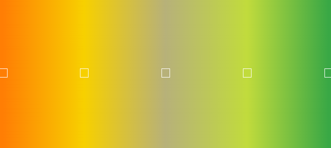
I really like the color blend combination of the orange yellow and greens -- you just have to be careful when combining or blending the orange next to green as they are both "secondary" colors and when combined they become a "mud" color-- or in other words, brown.  That is why having a yellow in between works as a sort of "bridge" and prevents the mud effect.  I explain a lot of these color mixing rules and tips in my Clay Color System.

So here are the recipes for these five colors using Kato clay.  Again, two of the colors are a very close match to previous Pantone colors and I have provided a link to those original recipes.
TANGELO
5 parts Kato Yellow
1 part Kato Orange


LEEK GREEN
2 parts Kato Yellow
1/4 part Kato Green
1/4 part Kato Gold
4 parts Ecru Mix #2-8 *


CLASSIC GREEN
1 part Kato Green
2 parts Kato Yellow
1/4 part White Mix #1-2 *


* Note:  These clay color recipes are created using Kato clay.  Any of the base color "mixes" used are from my Clay Color System.