Friday, February 25, 2022

Pantone Colors Spun Sugar & Harbor Blue

The two Pantone Spring colors, Spun Sugar and Harbor Blue are closer to the cyan blue or turquoise than a true shade of blue that we would normally think of.  They are both gorgeous colors on their own but I think I will experiment with using them in a combination to create a cane or other clay technique.  Perhaps both combined into a skinner blend?  The challenge is on if anyone else wants to give it a whirl.  You can share some of your experiments in the comments section on my Facebook page if you like.

In the meantime, I whipped up a few pair of stainless steel bezel earrings.  You might notice that at times the colors from the photos of the Pantone swatches do not perfectly match my clay samples.  This is due to the difference in computer screens and such.  The clay samples do match the actual Pantone colors and I will explain a little more about that tomorrow.


Here are the color recipes using Kato clay:

Spun Sugar
1 part Kato Turquoise
1/4 part Kato Blue
16 parts White Mix # 1-2 *

Harbor Blue
7 parts Kato Turquoise
1 part Kato Yellow
1/2 part Kato Black

*Note: These base color mixes are found in my Clay Color System Tutorial.


Thursday, February 24, 2022

Pantone Colors Skydiver, Poinciana & Gossamer Pink

I have three clay color recipes to share with you today.  Skydiver is a beautiful shade of blue and if you have my Clay Color System, then you already have this recipe as it is a very close match to #9-3 Blueberry.  Poinciana is a warm "heated" shade of red and a slight variation of last fall's color, "Fire Whirl".  Gossamer Pink is one of the softer colors for this season and is also a slight variation of another one of last fall's colors, "Pale Rosette".


So here are the recipes using Kato Clay:

Skydiver
Same as Recipe #9-3 *

Poinciana
3 parts Kato Red
1 part Kato Orange
1/4 part Kato Gold

Gossamer Pink
10 parts White Mix #1-2 *
1/2 part Kato Magenta
3 parts Ecru Mix #2-8 *
1/4 Kato Yellow

*Note: These base color mixes are found in my Clay Color System Tutorial.

Wednesday, February 23, 2022

Pantone Spring Colors Innuendo and Dahlia

Some of the colors in this year's Pantone Spring & Summer collection are very powerful and yet quite uplifting and joyful.  Dahlia is a beautiful purple, just like the flower.  Innuendo is a rich magenta and actually quite similar to a past Pantone color from fall 2013, called Vivacious, but it is a shade lighter (less saturated).  So if you already have a batch of clay in the Vivacious mixed, it can be easily used as a substitute.

Here are a few clay pieces I made in these two colors.  The large circles in "Innuendo" with the white print shown below will be finished off into interchangeable "snaps".  The other pieces are the colors filled into our stainless steel post earrings.


So here are the color recipes using Kato clay.

Dahlia

3 parts Kato Violet
2 parts Kato Magenta

Innuendo

5 parts Kato Magenta
1/2 part Kato Red
1 part White Mix # 1-2 *

*Note: These base color mixes are found in my Clay Color System Tutorial.


Tuesday, February 22, 2022

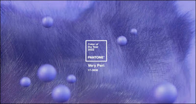
Clay Recipe for Pantone Color of the Year - Very Peri

So my inventory and business work took a little longer than expected and now I am getting back to my creative side again and oh it feels so good!  I actually like doing the book work but I find it can get to be a bit too much (overwhelming) after literally counting all the little do-dads in my studio workroom.  And yes there are way too many.  Why is it seems it is so difficult to clear out items you do not use anymore but so much easier to add new things????

So, I am finally busy mixing up and playing with the new Spring and Summer colors from the Pantone Collection and happy to share them with you again.

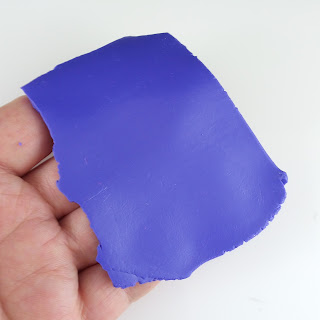
I managed to make a few pieces for earrings and snaps with the Pantone Color of the Year, Very Peri. I generally cut out my shapes from a patterned sheet and bake the fronts first.  Then I will finish them off into earrings or snaps by adding the backs and bake again.

The Very "Peri" is short for "Periwinkle" which is a perfect description as it is a soft purple with a bit of blue.

So here is the recipe for Very Peri using Kato Clay:

Very Peri

5 parts Kato Violet
1 part Kato Blue
1 part Kato White

I will be sharing the remaining Pantone Spring & Summer color recipes through the week.  If you have my Clay Color System, you will find that you already have several of these recipes.  Others are very similar to past Pantone colors with some slight tweaking.

So back to my studio to whip up more color magic!

Friday, January 14, 2022

Another Learning Curve & New Clay Color Recipes to Come

January is typically when I don't use the "right side" of my brain so much and typically exercise the "left side" with all my year-end book keeping and such.  I also use that time in between to brainstorm and plan what to do next such as mixing up the Pantone Spring Fashion Colors.

I already mixed up my recipe for the Pantone Color of the year which is Very Peri.  I will be sharing this clay color recipe with you very soon so stay tuned.


Another announcement is that I am currently working on new clay recipes using other clay brands besides Kato.  I have been experimenting with the various types and I should have them for you very soon.

I am not sure if any of you noticed that if you signed up for my blog posts to be sent to your e-mail box, it is no longer happening.  Sadly, Blogger decided to cancel that feature (apparently they are coming out with something else in future) so that kind of left everyone in limbo.  In the meantime, I would suggest you sign up with a type of blog reader where you can add your favorite blogs to a list and then they are sent to your e-mail box in one mailing.  The one I like to use most is Bloglovin' however there are others available.

I also am learning how to work a new newsletter app for my website/online store and still trying to figure things out but hopefully that will be resolved soon (fingers and toes crossed).

So once this left side of my brain gets a good work-out I think I will be ready (and itching) to get back to clay and creating again!  I hope you all had a nice Christmas and will be back soon with some new recipes!

Wednesday, December 8, 2021

Gingham and Buffalo Plaids

I really like my buffalo plaid tunic style shirts and leggings I purchased last year.  I practically live in them during the winter months as they are so cosy.  I usually wear them open style with different colored shirts underneath.

These shirts inspired me to make some buffalo plaid inspired jewelry pieces.  These all coordinate and as they are all interchangeable, can be worn a variety of ways.  Any colored pieces shown here are all in the Pantone Fall 2021 Fashion color Fire Whirl and Black.

Large interchangeable "snap" on a cork "snap base necklace"

Buffalo Plaid interchangeable "snap" on a cork bracelet and necklace

Buffalo Plaid Post Earrings

All the interchangeable snaps and jewelry pieces shown here are available in the Shuswap Artisan Market in Sorrento BC, Shear FX Studio in Chase BC and in my online store.

Wednesday, November 24, 2021

Sweater Print Snaps for the Holidays

I can hardly believe how much time has lapsed since my last post.  Right after I had urgent eye surgery.  I had another hole in my retina repaired -- this was the second time but this time in my other eye.  I had to be careful for 3 weeks after -- no stooping, hanging my head down, bending over or lifting anything more than 5 lbs -- which meant I couldn't really do much.  I did manage to rest up which was a good thing.  Right afterwards, however, I ended up with an intense pain in my arm -- mainly my elbow.  Today I am finally feeling a bit more back to normal but babying that arm so as to not aggravate it any more than I have to.  I am discovering that aging really sucks and wish I could trade a few body parts in for some new ones!

So I did manage to finish off some items which will be delivered to the Artisan Market in Sorrento and Shear FX Hair Studio in Chase later this week -- that is as long as the weather cooperates.  We have had some huge torrential rain storms resulting in major flooding in our part of Canada.

Where I live (interior BC) is fine, however the flooding destroyed all of the highways between us and the coast.  This means that there is only essential travel to the coast and supplies are being transported through at a snail's pace.  Canada Post put our area on a yellow alert which means that the mail service will be very sporadic and extremely slow for a long time.  So if you are planning on ordering anything from my online store, please allow an extra week or so for delivery. 

So here are some Christmas sweater themed pieces I created using more silkscreens from Tonja Lenderman.  I really love the sweater designs which were fun to create with.  All of these pieces are on a snap so they can be interchanged.


I have added some of these pieces to my online store.  The necklaces shown in the above photo are cork in (off) white and available in many different colors.