Showing posts with label clay recipes. Show all posts

Friday, October 3, 2025

Summary of the Fall/Winter 2025 Pantone Fashion Color Clay Recipes

After sharing the clay recipes for the Pantone seasonal colors, I like to have a summary posted.  It is then added to the page (see the tab at the top of this blog "Pantone Color Recipes") where you can find other clay recipes from the past years.  You can see that I have been mixing these colors up and sharing them for quite a few years.  The first ones I share here were in 2011.

So you can click on the color cube photos below to see the clay recipes I recently shared with you.  I would love to see anything you might have created in these colors and you could share them with us on our facebook page if you like.

Mocha Mousse


Clay Recipes for:
Primrose Pink, Damson, Hot Chocolate,
Bronze Brown, Chili Oil

Clay Recipes for:
Brandied Melon, Lemon Grass, Lyons Blue,
Poppy Red, Winterberry

Look for the new adapted recipes using Cernit Clay which will be posted in the near future.

Last five clay recipes for the Fall 2025 Pantone Fashion Colors

Here are the last five clay recipes for the 2025 Pantone Fall/Winter Fashion Colors.  I hope you find them inspiring and a great way to kick start your creativity.  With all the noise going on around us these days, it helps to distract oneself with some form of craft.  I have always found that working with polymer clay can be very calming.  Sometimes while I am just mixing my colors, my mind wanders and I can imagine various designs to create with them including various combinations.

The recipes posted here were created with Kato clay and I will be mixing up the same in Cernit clay over the next few weeks and will post those recipes here later.


Brandied Melon (Kato Clay)
2 parts Kato Orange
1 part Kato Magenta
1 part Kato Gold
4 parts Ecru Base #2-7
2 parts Kato Brown

Brandied Melon (Cernit Clay)
Will be posted at a later date


Lemon Grass (Kato Clay)
2 parts Kato Orange
1 part Kato Magenta
1 part Kato Gold
4 parts Ecru Base #2-7
2 parts Kato Brown

Lemon Grass (Cernit Clay)
Will be posted at a later date


Lyons Blue (Kato Clay)
4 x Kato Blue
1/2 part Kato Turquoise
1 part Kato Black
1 part Ecru Base #2-7 *
1/2 part Kato Pearl (optional)

Lyons Blue (Cernit Clay)
Will be posted at a later date


Poppy Red (Kato Clay)
1 part Kato Red
1 part Kato Pearl

Poppy Red (Cernit Clay)
Will be posted at a later date


Winterberry (Kato Clay)
Use Clay Recipe #4-3 * (Pimento) 

Winterberry (Kato Clay)
Will be posted at a later date

* Note:  These clay color recipes are created using Kato clay.  Any of the base color "mixes" used are from my Clay Color System.  And don't forget that our Tutorial lessons are on sale right now in our online store -- I have extended the sale to the end of the week -- Sunday, October 5.

Saturday, February 26, 2022

Why Pantone Colors and Polymer Clay Recipes?

Since the pandemic hit in 2020, there has been a huge influx of people wanting to find ways to fill their time and explore new crafts, many of which have discovered polymer clay.  I have been playing with this type of clay for quite a few years and I still appreciate how one can be so creative with it but what attracted me the most was the possibilities with mixing colors.  I started out using the typical Sculpey Premo clay until I discovered Kato clay.  I immediately preferred this brand due to it being formulated in the "true artist colors".  It can be mixed and combined to create other colors, shades and hue just like using artist quality paints.  I quickly learned that I could do so much more by mixing my own colors, rather than just using it right out of the package.

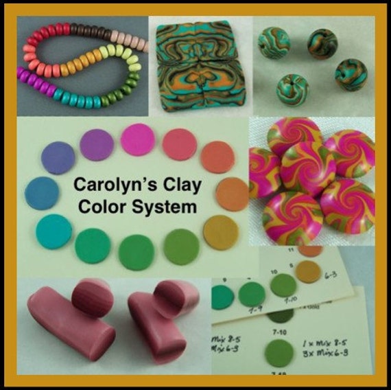
I soon had so many colors mixed that I needed a way to organize my color stash so I could use it again later.  This eventually expanded into my first tutorial, Carolyn's Clay Color System.  This lesson contains a whole lot more than just mixing up color recipes.  It is an easy way to learn all about color and how to create your own blends.  There are easy to follow charts for creating your new colors which can be so much fun.  And with this system, you are not wasting a lot of clay like other color mixing methods.


My Color System tutorial is available in my online store (Canadian) here,

NOTE:  Check out my facebook page here to see my special sales on all of my tutorial lessons (until March 10).

So what is Pantone?  And why do I share clay recipes for these colors?  The Pantone Color Institute determines the color palettes for the fashion industry and there is a new palette of colors twice a year -- Spring & Summer and Fall & Winter.  I am a Pantone "member" and with my Pantone color charts plus apps, I like to mix up the latest fashion colors in clay to create up-to-date jewelry pieces, buttons and other items.


I also like to share these new recipes for those who have purchased my Color System tutorial, so they can add them to their collection.  My Color System contains the base colors that are sometimes used to create these new Pantone recipes as in the example shown below as in the "White Mix" and "Ecru Mix":

So this system was created using Kato clay but it can also be adapted to other clays but mainly brands that are created in true artist colors such as Fimo Professional.  Because some of the saturation in the colors can vary between clays, the amounts might require some tweaking.  I am currently working on some variations of my Color system using other clay brands plus more color recipes that will be using those other brands as well.  Follow this blog or my facebook page to keep up to date.

So tomorrow I will share the remaining Pantone color recipes for this Spring and then follow up with some ideas and inspiration for you.

If you have any questions or want to share, you can always post on my facebook page.  I would love to hear back from some of my followers.

Friday, February 25, 2022

Pantone Colors Spun Sugar & Harbor Blue

The two Pantone Spring colors, Spun Sugar and Harbor Blue are closer to the cyan blue or turquoise than a true shade of blue that we would normally think of.  They are both gorgeous colors on their own but I think I will experiment with using them in a combination to create a cane or other clay technique.  Perhaps both combined into a skinner blend?  The challenge is on if anyone else wants to give it a whirl.  You can share some of your experiments in the comments section on my Facebook page if you like.

In the meantime, I whipped up a few pair of stainless steel bezel earrings.  You might notice that at times the colors from the photos of the Pantone swatches do not perfectly match my clay samples.  This is due to the difference in computer screens and such.  The clay samples do match the actual Pantone colors and I will explain a little more about that tomorrow.


Here are the color recipes using Kato clay:

Spun Sugar
1 part Kato Turquoise
1/4 part Kato Blue
16 parts White Mix # 1-2 *

Harbor Blue
7 parts Kato Turquoise
1 part Kato Yellow
1/2 part Kato Black

*Note: These base color mixes are found in my Clay Color System Tutorial.


Monday, September 20, 2021

Pantone Fall 2021 Fashion Colors Mykonos Blue, Spring Lake and Rhodonite

I never thought I would ever say I looked forward to fall but this is one of those years!  Between the drought and extreme heat wave that broke records and lasted a good part of the summer, the more than 300 forest fires burning at one time over our province of British Colombia, and dealing with the heavy smoke from living in the center of it all, the rain and cool weather is a great relief.

So it has been very soothing to take my mind off things by mixing up the Pantone Fall colors and creating some new pieces with them.  I love these new colors as they are a lovely combination of fall, warmth, neutrals and rich, vibrant hues.

Silkscreened Buttons in Illuminating and Ultimate Gray

I already shared with you the clay recipes for the Pantone Colors of the year, Illuminating and Ultimate Gray.  You can find those in my previous blog post here.


These are extra color chips I made for myself in a larger size.  They work nicely for color inspiration, mixing and matching.  In my previous announcement, I will be doing a pop-up at Kelowna Yarn & Needlecrafts this coming Friday.  The owner, Cheryl, really liked my color chips and asked for a set for herself to use for dying her own yarn.  I realized that others might appreciate a set as well so I now have them listed in my online store here.

Polymer Clay Buttons in Mykonos Blue (left) and Spring Lake (right)

I thought I would start with the clay recipes for the three blues:  Mykonos Blue, Spring Lake and Rhodonite, which is actually a blue-based purple.  If you have been following my blog and the Pantone color recipes for some time, you might recognize the Mykonos Blue from several years ago -- Fall 2013 to be exact.  I am not sure what happened, but I have recently purchased a new updated set of the Pantone color chips and while matching this color I noticed quite a difference.  I really like the original color from earlier but also like this new updated shade as well so I have labelled this one my new Mykonos blue.

So here are the color recipes using Kato clay.  I know a lot of my followers out there have jumped ship and given up on using Kato clay.  It is still the main clay I prefer to use, at least for now.  I have started experimenting with the Cernit clay and considering reworking my recipes using it.  I will see how it goes and keep you posted.

Mykonos Blue

4 parts Kato Blue
1 part Kato Turquoise
1 part Kato Pearl
1/2 part Kato Black

Spring Lake

1 part Navy - Recipe # 9-7 *
1 part Kato Silver
3 parts White Mix # 1-2 *

Rhodonite

1 part Purple Base # 10-2 *
1 part Navy - Recipe # 9-7

* Note:  These clay color recipes are created using Kato Polyclay.  Any of the base color "mixes" used are from my Clay Color System.

Wednesday, September 15, 2021

Pantone Fall 2021 Fashion Colors + Pop-up Show

I seem to be finally catching up with things and my Fall Pantone fashion colors are mixed up and ready to go!  I will be sharing the clay recipes with you very shortly, so stay tuned.

One of the stores that still sells my work is Kelowna Yarn & Needlecrafts. And now that I have moved to Kelowna, I am only a few minutes drive away which is so awesome.

One thing the owner, Cheryl, and I have in common is the love for color and an appreciation for the Pantone Fashion colors.  Making buttons and jewelry pieces in the latest colors keeps things fresh and vibrant.  These buttons were created in the Fall Pantone colors and will be delivered to the Kelowna Yarn store later this week in time for their anniversary celebration the following weekend.


I will also be at the Kelowna Yarn Store for a pop-up next week Friday, Sept 24 and will have a wide range of accessories for knitting/crochet as well as my Snap Decisions Collection.  There will be a door-prize and bonus gift with a minimum purchase so stop on by if you are in the area.

Monday, January 28, 2019

Clay Recipes for the Pantone Spring Fashion Colors Princess Blue and Toffee

The last two clay recipes of the main Pantone 2019 spring color palette are Princess Blue and Toffee.  Tomorrow I will share three more clay recipes which are the Neutrals.  Sweet Corn is one of these neutrals which I have decided to show here as well.  If you have my clay color system, you already have this recipe along with the Toffee.

Here are some samples I mixed up combining these three colors.  The earring dangles (diamond shape) are all reversible and can be worn on their own or added to the posts.

Sweet Corn & Toffee

Princess Blue & Toffee

Reversible & Interchangeable Earrings
Princess Blue, Toffee & Sweet Corn

And finally the recipes for the Pantone colors Princess Blue, Toffee and Sweet Corn using Kato clay.


Princess Blue
8 parts Kato Blue
1 part Kato Violet
2 parts Kato Pearl
1 part Ecru Mix #2-8 *

Toffee
Same as clay recipe
Tanned Leather # 3-6 *

Sweet Corn
Same as clay recipe
Cream # 2-10 *


* Note:  These clay color recipes are created using Kato clay.  Any of the base color "mixes" used are from my Clay Color System. 


My Clay Color System tutorial, is available in my Online Store (Canadian pricing and sent to the e-mail address you provide).

Sunday, January 27, 2019

Clay Recipes for the Pantone Spring 2019 Colors Pink Peacock, Fiesta and Turmeric

The three Pantone Spring 2019 colors Pink Peacock, Fiesta and Turmeric are all close together on the color wheel so I wanted to play around with more color blocking to show how they go well together.


I find that the as I experiment with the same technique over and over, each time my ideas expand a bit more.  This is how we learn to develop our own style.  In playing around with simple color blocking, I came up with this circular design that looks like a bulls eye.  These earrings could simply be worn on their own or for more fun, interchanged with the diamond shape reversible drops.


So here are the recipes for the Pantone colors Pink Peacock, Fiesta and Turmeric using Kato clay.

Pink Peacock
6 parts Kato Magenta
1/2 part Kato Yellow
1 part White Mix #1-2 *

Fiesta
1 part Kato Red
1 part Kato Orange

Turmeric
12 parts KatoYellow
1-1/2 parts Kato Orange
1 part Kato Gold
1 part Kato Pearl


* Note:  These clay color recipes are created using Kato clay.  Any of the base color "mixes" used are from my Clay Color System. 


Tuesday, January 14, 2014

Carolyn's Clay Color System for Other Polymer Clay Brands

I thought I would give you an update on my Clay Color System.  Even though the color recipes included in my tutorial are based on Kato clay, the tutorial itself can be used with any other clay brand.  If you find mixing colors sometimes a little confusing or complicated, then you will find this color system very helpful. Included are several worksheets to help you learn about color mixing and combining and to assist you in exploring color and creating your own color recipes.

But this tutorial is more than just clay color recipes.  It is an entire system for organizing your recipes as well as the clay that you mix up.  And now included is a second set of recipe cards to use with any other polymer clay brand.  While they do not contain the kato clay color recipes, some of the base mix recipes are included that can be applied to other clays such as Premo or Fimo.  You can still use the color system tutorial to explore color mixing and the color recipe cards for saving your own recipes and baked clay color chip samples.


I have received a lot of positive feedback on this tutorial and would like to share some of those comments with you.  I have left the names anonymous and would like to thank those who took the time to share there appreciation with me.

* Love this color system!  Very easy to follow and very detailed.

* A great tutorial.  It unlocks the mystery of color mixing.

* This tutorial is fabulous!  So much detail and advice!  Now just need to ... start making my color samples!

* Terrific tutorial.  Very happy with this purchase.  Can highly recommend.  A+++

* This is a really great color tutorial with many wonderful worksheets and ideas.

* Quick delivery and a lot of fun!  My photo album is filling up nicely!

* Excellent tutorial!  Great way to learn about color and organize your clay stash.

You can also read a review by Wendy Orlowski here and Cynthia Blanton here.  Both of them suggest making an extra set of color chips so they can play with them on their work table to see how the colors go with one another.


Thursday, September 6, 2012

Pantone Color Recipes Pink Flambe and Ultramarine Green

I'm going to share two more Pantone Fall 2012 clay color recipes again with you today -- Pink Flambe and Ultramarine Green.


Pink Flambe
5 x Kato Magenta
1 x Kato Orange
1 x Kato Pearl
1 x Kato White

Ultramarine Green
6 x Kato Green
1 x Kato Blue
1 x Kato Pearl

You will find that when you mix up your clay colors they might appear slightly different from the samples shown above or other images on your computer.  This is because every computer screen can show colors quite differently.  When I mix up my clay colors I use the actual Pantone color chips to match and get a more accurate hue.


Here are a few pieces I was experimenting with combining the above two colors along with Bright Chartreuse and Tangerine Tango.

Some mokume gane:  (I haven't decided how I will use this clay sheet yet)