Tuesday, March 21, 2023

Pantone Spring 2023 Fashion Colors - From Magenta to Red to Peach

The five colors, Fiery Red, Beetroot Purple, Peach Pink, Crystal Rose & Vanilla Cream are all close to each other on the color wheel.  They range from a magenta to red to a peachy pink.  The color wheel diagram below shows where they are actually located and how close they are to each other.

Colors left to right:
Beetroot Purple, Fiery Red, Crystal Rose, Peach Pink, Vanilla Cream

In fact, the color wheel below shows where Viva Magenta (Pantone Color of the Year 2023) fits in, which is right between Beetroot Purple (far left) and Fiery Red.

Colors Left to Right:
Beetroot Purple, Viva Magenta, Fiery Red, Peach Pink

I have the Pantone Connect app which is a lot of fun to play with.  You can create your own color palettes and see how the colors go together.  Here are a few examples using these five colors:

Gradient Blend

Different Background Combinations

Light vs Dark Background

Another feature with this app is that you can cross match Pantone colors and find other colors that are a close match.  I have so many clay color recipes in my "library collection" and if a new Pantone color is a close match to one I already have, I will prefer to just stay with that color instead of tweaking it ever so slightly.  It makes life in the studio a whole lot easier!  One example of this is the new Spring 2023 color, Beetroot purple, is a close match to a previous Pantone color from Spring 2017 called Pink Yarrow.

Another close match to the Pantone color, Crystal Rose, is Gossamer Pink which was one of the Pantone Spring colors from last year.

The Pantone color, Peach Pink was the exact same color used in the Pantone Fall 2019 palette.  Creme De Peche was another color used in the same Pantone Palette and is a close match to this year's spring color, Vanilla Cream.


And lastly, if you have my Clay Color System tutorial, then you already have the clay recipe for Fiery Red.  It is a very close match to Cadmium Red, recipe # 4-2.

So just click on the color names below to see the original recipes posted on my blog:


FIERY RED
(see Recipe #4-2 * in Carolyn's Clay Color System)

Monday, March 20, 2023

Viva Magenta! Pantone Color of the Year 2023

I am finally back and must apologize for the long delay.  I have had many things to deal with lately which I will be able to share eventually but not now.  In the meantime, I have just finally begun to mix up some of the new Pantone Spring Fashion colors for this year.

Pantone announced their color of the year for 2023.  It is called Viva Magenta!


I have been seeing a lot of facebook posts regarding this new color.  Some show it as an almost true magenta where some have even shared it as a plum or purple.

So is this color really a shade of magenta?  Or is it more a deeper red?

Leatrice Eiseman, Executive director of the Pantone Color Institute, explains how they "drew inspiration from nature and what is real.  Pantone, Viva Magenta, descends from the Red family and is inspired by the red of cochineal, one of the most precious dyes belonging to the natural dye family as well as one of the strongest and brightest the world has known.

Image credit: Vahe Martirosyan [CC BY 2.0], via Flickr

Cochineal is one of the most important insect dyes and you can read more about it here.  And this is another interesting article on its' history:   The Bug That Had the World Seeing Red

The dye it produces is a deep rich shade of red.  By adding various other ingredients, however, it can change to shades of pink, purple and even orange.  I have found that the Pantone color, Viva Magenta is a combination of both red and magenta.  That is why it is so difficult to determine on which side of the scale it really is.

As I mixed up the clay color to match my Pantone Swatch, I suddenly realized that this color looked awfully familiar!  I grabbed my samples and ran to my kitchen to discover why I had recognized it.  It was a dear ringer match for the color on the walls I had painted!  You can see my blog post here on the renovations I did.


I love this warm color and how it makes me feel whenever I am in the kitchen. I was looking for the paint color number but couldn't find the paint chip sample.  I used a Behr paint in a satin finish (recommended for kitchens).  When I find the color chip number I will add it here.

I haven't had time to create anything with my polymer clay version yet but should later on -- after I mix up the spring colors.  So here is the recipe using Kato clay:

Viva Magenta

4 parts Kato Magenta
3 parts Kato Red
1/8 part Kato Black


As you can see it is a very simple recipe that makes such a rich and exotic color!  I will be back shortly with more of my clay recipes for the spring colors.

Thursday, January 12, 2023

Snap Decisions Tutorial & Bonus

A new year has already started and I am so ready to put 2022 behind me!  But it seems the cycle never ends and January means back to end of year bookkeeping, taking inventory and such.  Counting all the trillions of little items for inventory is not my favorite task but has to be done.  I am quite strange though as I have taken all the accounting courses and quite enjoy it.  I just find it difficult to switch back and forth between that and my creativity in the studio.  It is like a struggle that goes on between the right side and left side of my brain.  So I will forge ahead and wrap up the paperwork as quick as possible so I can go back to the fun side of life!

Unlike a New Year's resolution, I have instead been contemplating on what my focus should be for this year and I feel I have a good plan.  I have already started off by implementing a few changes with more to come later.


Eight years ago I created my first interchangeable "snap" jewelry pieces!  This idea was a real game changer for me and I still love the whole concept.  Since then, I have expanded my collection a great deal and I plan to continue on and still make it my main focus.


I published my "Snap Decisions" tutorial back in 2015 which I since had for sale -- that is until now.  It is no longer for sale -- that is as an individual lesson.  It is now included (at no charge) with the purchase of my new "Starter Packs".  These starter packs include a wide range of snaps and accessories (items may vary slightly from the photos) that will jumpstart your creativity and hopefully to have fun creating your own original designs!

Here is how it works:

With the purchase of starter pack 1, you will receive as follows:
- a wide range of snaps and snap accessories.
- Part 1 of my tutorial (PDF format)

A total value of $75+  for only $60 Cdn. (plus shipping and taxes if applicable)


With the purchase of starter pack 2, you will receive as follows:
- a large supply of snaps and snap accessories
- Parts 1 & 2 of my tutorial (PDF format)
- Bonus:  Your own personal coupon code for future discounts from our DIY Snap & Jewelry supplies.  (Note: Coupon code must be used at least once a year in order to keep it activated).

A total value of $120+  for only $95 Cdn (plus shipping and taxes if applicable) 


The tutorial(s) that is included with your starter pack will be sent out separately as a PDF file directly to the e-mail address provided.  This will give you a head start to read it through and familiarize yourself before your snaps arrive in the mail.

These packs are a lot of fun and provide a sampling of many items to not only get you started but also get a feel for any items you might want to make more of in the future.

Personal Coupon Code

So what is the personal coupon code?  This is included only with the Starter Pack 2 -- The larger pack that includes both of parts 1 & 2 of my Snap Decisions tutorial.  It is your own personalized code (not to be shared with anyone else) for a 25% discount on any future supplies from our online store.  This is a great saving as most of the items in those categories are already at bulk prices.

The coupon code does not expire, that is, as long as it is used at least once a year.  The year starts from your date of purchase.


If you do already have a coupon code and it has expired, then you can purchase the starter pack 2 and your code will be reactivated again.  You will also receive the starter pack of snaps and snap accessories included.

And now, one more announcement:

I have created a Facebook Group:


This is a group that I am just now starting and you can click on the link above to join.  I hope it will be of some help to those who could use some inspiration as well as more tips and tricks on creating your own interchangeable snap jewelry.  Hopefully I will get to meet up with many of you there.

Thursday, September 1, 2022

Pantone Fall 2022 Core Classics

Pantone has added five more colors to their fall/winter palette which they call their "Core Classics".  They are types of neutrals and can be combined with any of the main fall/winter colors.

Pantone Core Classic Colors:
Loden Frost, Autumn Blonde
Arctic Wolf, Polar Night, Chiseled Stone 

Artic Wolf, Polar Night and Chiseled Stone are just your basic colors, white, black and grey, respectively.  Artic Wolf is actually more of an off white.  I have to say that is one of my main dislikes with Kato clay is that their white is not really pure white but more of an off white and wondering if anyone else has noticed this?  Just hold the block of clay next to a white from any other brand of clay and you will see what I mean.  And not only is it not that white to begin with, it is notorious for discoloring even more after baking!  Donna Kato had publicly shared how she bakes her transluscent pieces in a pan of baking soda (completely cover the item) to prevent darkening or discoloring.  I do the same for my whites as well.

I actually bake this way with a lot of my clay beads and larger items for another reason -- to prevent them from actually cracking!  I use to get a lot of pieces with surface cracks until I started baking my pieces this way.  Just a quick note:  I know many have confused baking soda with cornstarch.  I do NOT recommend cornstarch to be used this way.  After baking, the baking soda will wash right off where cornstarch will not and actually get embedded into the clay.  Cornstarch works best only as a mold release when water isn't suitable.

Anyhow, I felt it was futile to mix up more shades of white, black and grey but will share recipes for Loden Frost and Autumn Blonde.  Loden Frost is a very soft and muted shade of green.  For Autumn Blonde, the color "Linen" is a close match which could be used instead.  This color was in the Pantone Spring 2013 palette and you will find the clay recipe here.

Here are the two color recipes using Kato clay:

Loden Frost
2 parts Cilantro #7-3 *
1 part Ecru Base # 2-7 *

Autumn Blonde  (Linen)
14 parts Kato Beige
1 part Ecru Mix # 2-8 *
1 part White Mix # 1-2 *

*Note: These base color mixes are found in my Clay Color System tutorial

Tuesday, August 30, 2022

Pantone Fall Colors Caramel Cafe, Midnight & Martini Olive

Here are three more clay recipes I want to share with you from the Pantone fall 2022 fashion color collection:  Caramel Cafe, Midnight and Martini Olive.

Caramel Cafe is a soft and warm shade of brown that definitely reminds me of autumn. I am also seeing a lot of animal prints in the stores going into fall.  I generally do most of my animal prints with "canes" that I create myself but I happened to have this silk screen from Tonja and so thought I would try it out.  There are six different style prints on one silkscreen so I decided to experiment with three different clay colors and screen print all at the same time.  I lined up the Caramel Cafe for a Leopard print, a white for the zebra and a grey for the snake.


I then screen printed all three colors at the same time in black and this is the result.  So now I need to decide what I will create with it.

Midnight is a dark blue similar to denim.  In fact I have used this exact blue recipe to create some of my faux denim pieces.  In order to do this, all you need is actual denim fabric to use as your texture!  I just create a thick sheet of smooth clay, spray the denim fabric and clay with water as a mold release and then run it through the pasta machine together on a thinner setting.  (Tip: this does not work with Fimo clay as fimo reacts badly to water and will become really wierd and gummy so best to do this with any other type of clay).


By the way, the Midnight blue clay shown above here looks a bit lighter but that is because it will darken after it is baked.  In fact many of the Kato clay colors will change slightly after baking and so when I first create my recipes I generally allow for this factor and the final color match test is after it is baked.

So here are some denim snaps and earrings I have created using this exact blue color.  After texturing, I create my pieces and bake.  After baking I will rub in white acrylic paint (make sure it is acrylic or compatible with the clay) and then rub off any excess until I get the look that I want.  I will then bake again to make the paint adhere to the clay more.


Martini Olive is a rich olive green and slightly darker than the Olive green in my Clay Color System.  It is also one of my favorite colors I like to wear and create with.  It combines well with so many colors and is more of a shade of green for fall rather than spring or summer.  Here are some finished pieces that I created using the same olive green combined with other colors that might not be specific to this falls Pantone color palette but are very similar:


So here are the three color recipes using Kato clay:

Caramel Cafe
4 parts Kato Brown
1/2 part Ecru Base # 2-7 *

Midnight
3 parts Navy Blue # 9-7 *
1 part Kato Pearl

Martini Olive
Follow clay recipe for Olive Green # 7-8 *
Add 1 part Kato Black

*Note: These base color mixes are found in my Clay Color System Tutorial.


Monday, August 29, 2022

Pantone Fall Colors Nosegay & Waterspout

The two Pantone fall colors Nosegay and Waterspout are much lighter and less intense than the other colors in this seasons pallet and have a very calming effect.

They may seem more like summer colors but combined with some other colors in the winter palette can really change the effect.

Nosegay with Midnight and Amazon

Waterspout with Caramel Cafe and Midnight

And here are the two colors that have a silkscreen pattern in black which creates a great contrast and dramatic effect.  Both silkscreens are new ones I am trying out that were created by Tina Holden which are available in her Beadcomber Etsy shop here.  I will show you how my pieces I am making with these clay sheets come out when they are finished.

When I researched the color Nosegay, I discovered that Sweet Lilac is a close match and was previously used in the Pantone fall 2012 color collection.  I will share the same recipe again here but you can also find it in my first original post in February 2012 for reference.

Nosegay is a close match to Sweet Lilac

Waterspout is a gorgeous turquoise-like shade that reminds me of the ocean waters surrounding a tropical island.
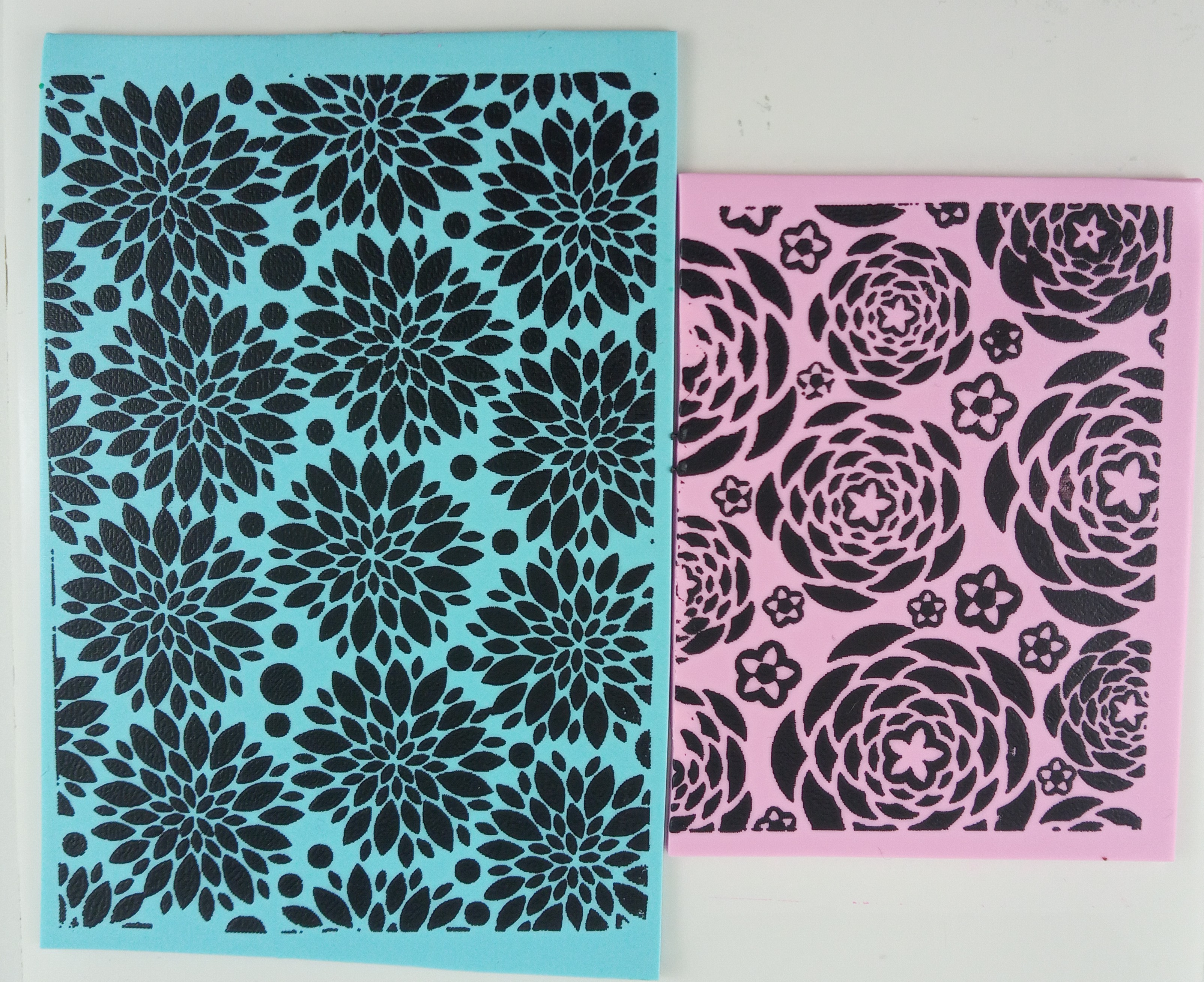
So here are the color recipes using Kato clay.

Nosegay (Sweet Lilac)
1 part Kato Magenta
15 parts White Mix # 1-2 *

Waterspout
1 part Kato Turquoise
1/4 part Kato Green
10 parts White Mix # 1-2 *

*Note: These base color mixes are found in my Clay Color System Tutorial.