Tuesday, March 22, 2022

Pantone Color Samples in Very Peri, Innuendo and Harbor Blue

I just wanted to share some pieces that I created with some of the new Pantone Spring colors.  These have all been screen printed using various patterns.  The smaller pieces shown are post/stud earrings and the other items are all mounted on a snap so they are interchangeable.  Some items are already available in the Shuswap Artisan Market, in Sorrento, as well as our online store.  We have a category set up to make shopping the latest Pantone colors easy and you can see them here.

Very Peri
Crystals used are Purple & White Opal

Innuendo
Crystals used are Magenta-Orchid AB

Harbor Blue
Crystals used are Blue-Green AB

The crystal rhinestones used in the pieces shown above are available in our online store.  We have them in 3 sizes with a special if you purchase all 3 sizes (buy 2 packages and receive the 3rd free).

Thursday, March 3, 2022

New Flatback Crystals for Polymer Clay

I like to incorporate crystal rhinestones into my clay designs.  They make a perfect accent and give the pieces a more finished look plus who doesn't love a little bling?  Up until recently, I used exclusively genuine Swarovski crystals, however, they quit producing the type that is compatible with the clay (flatbacks with the hotfix glue) and what colors remain on the market are very limited but also very pricey.

I go through a lot of crystals in my work and since my stash was running low and Swarovskis were difficult to find, I had to come up with another solution.  I have since discovered new crystal rhinestones that are manufactured right here in my own country of Canada!  These crystals are amazing!  I find the cuts are very close to the Swarovski crystals (and is hard to tell the difference, really) and the colors are so rich and intense.

Because I order huge amounts, I get volume pricing and decided to make them available in our online store.  I have them available in 3 of the most popular sizes - 4, 5 and 6mm. 

Here are some samples of what is already available in my shop and I have matched some of these up with the new Pantone spring colors for visualization.  You can click on any of the photos below to see that specific crystal color listed.

The yellow crystals shown below are what they call "AB" which is an abbreviations for "Aurora Borealis".  These give off a sort of rainbow effect when they reflect the light.  Their beauty is difficult to capture in a photograph.  The crystals here are the same in both photo and with the Pantone Spring color Daffodil, but appear differently depending on the angle of my camera.


Here is another gorgeous color that has 2 main colors that reflect but also have an "AB" finish.  These are shown on two of the Pantone Spring colors, Innuendo and Dahlia.  See how the crystals pick up the color of whichever one they are on?


The crystals shown below are a blue and turquoise green combo and here they are on the Pantone Spring color, Skydiver.


The crystals below are called Hyacinth.  They reflect an orangey type red and are shown here on the Pantone Spring color Poinciana.  These crystals are one of my favorites and was very difficult to capture their true beauty.


The Aqua crystals shown here do not have the AB or reflective coating but are still very stunning due to the cuts and clarity.  Here they are shown with the Pantone Spring color Spun Sugar which compliment quite well.


And of course these purple crystals are very different than your typical Amethyst color.  The purple color is quite deep and intense and also a perfect compliment to the Pantone color of the year, Very Peri!


The crystals shown below are my absolute favorites!  They are a White Opal and have a milky  appearance.  I love how they make a great accent instead of plain clear crystals and find they combine well with my screen prints when I use white acrylic paint to create the patterns.  They work well when I do not have that perfect color match to the clay.


I have more colors listed in my online store which you can check out here along with other jewelry supplies that I use in my tutorial lessons.

Wednesday, March 2, 2022

Clay Recipes for the Pantone Spring 2022 Fashion Colors

 So here are is a review of all the Pantone Spring & Summer fashion colors for 2022.  Click on the photos below to see the individual recipes and inspiration ideas.  If you would like to see more Pantone clay recipes from the past, click on the tab at the top of this blog.


Monday, February 28, 2022

The Core Classics of the Pantone Spring & Summer 2022 Fashion Colors

There are five colors added to the Pantone Spring & Summer palette called the "Core Classics".  These consist of a white, beige, green and two shades of grey.  When I create patterned clay using the "Mokume Gane" technique, I like to incorporate at least one neutral shade with my colors.  These Core Classics could work quite well in this case and I will share some examples with you later.

Here is an example using one of the Classics, called "Snow White".  If you have my Clay Color System, then you already have this recipe.  It is the same recipe as #1-2 White Mix.  I use this base white in a lot of color recipes as it adds a bit more depth and the end result is not as "flat" as just using plain white.  I also like to use the #1-2 White Mix (Snow White) instead of must plain white, as a contrast when creating with the Mokume Gane technique as shown below:


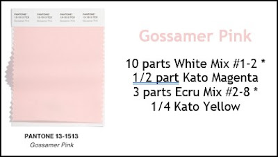
So here are the recipes for the five Pantone Classic Core colors using Kato clay:


*Note: These base color mixes are found in my Clay Color System Tutorial.

Sunday, February 27, 2022

Pantone Spring Colors Glacier Lake, Daffodil & Coca Mocha

The last three color recipes to share from the Pantone Spring 2022 Collection are Glacier Lake (an icy blue-grey), Daffodil (like the spring flower) and a "chocolatey" Coca Mocha.


There are five more colors for this spring that Pantone refers to as "Core Classics".  I have mixed all of those up and will share the recipes with you tomorrow.  And then the fun begins!  Combining these seasonal colors by using various techniques and such which I will have samples of for you soon.  So here are the recipes for the above colors using Kato clay:

Glacier Lake
1 part Kato Blue
1/2 part Kato Violet
2 parts Kato Silver
8 parts White Mix #1-2 *

Daffodil
10 parts Kato Yellow
1 part Kato White
1/8 Kato Orange
1/8 Kato Gold

Coca Mocha
5 parts Kato Brown
1/2 part Kato White
1/2 part Kato Black

*Note: These base color mixes are found in my Clay Color System Tutorial.

And don't forget the sale we have on right now on all my tutorials in our online store -- you can see the details on my Facebook page here.

Saturday, February 26, 2022

Why Pantone Colors and Polymer Clay Recipes?

Since the pandemic hit in 2020, there has been a huge influx of people wanting to find ways to fill their time and explore new crafts, many of which have discovered polymer clay.  I have been playing with this type of clay for quite a few years and I still appreciate how one can be so creative with it but what attracted me the most was the possibilities with mixing colors.  I started out using the typical Sculpey Premo clay until I discovered Kato clay.  I immediately preferred this brand due to it being formulated in the "true artist colors".  It can be mixed and combined to create other colors, shades and hue just like using artist quality paints.  I quickly learned that I could do so much more by mixing my own colors, rather than just using it right out of the package.

I soon had so many colors mixed that I needed a way to organize my color stash so I could use it again later.  This eventually expanded into my first tutorial, Carolyn's Clay Color System.  This lesson contains a whole lot more than just mixing up color recipes.  It is an easy way to learn all about color and how to create your own blends.  There are easy to follow charts for creating your new colors which can be so much fun.  And with this system, you are not wasting a lot of clay like other color mixing methods.


My Color System tutorial is available in my online store (Canadian) here,

NOTE:  Check out my facebook page here to see my special sales on all of my tutorial lessons (until March 10).

So what is Pantone?  And why do I share clay recipes for these colors?  The Pantone Color Institute determines the color palettes for the fashion industry and there is a new palette of colors twice a year -- Spring & Summer and Fall & Winter.  I am a Pantone "member" and with my Pantone color charts plus apps, I like to mix up the latest fashion colors in clay to create up-to-date jewelry pieces, buttons and other items.


I also like to share these new recipes for those who have purchased my Color System tutorial, so they can add them to their collection.  My Color System contains the base colors that are sometimes used to create these new Pantone recipes as in the example shown below as in the "White Mix" and "Ecru Mix":

So this system was created using Kato clay but it can also be adapted to other clays but mainly brands that are created in true artist colors such as Fimo Professional.  Because some of the saturation in the colors can vary between clays, the amounts might require some tweaking.  I am currently working on some variations of my Color system using other clay brands plus more color recipes that will be using those other brands as well.  Follow this blog or my facebook page to keep up to date.

So tomorrow I will share the remaining Pantone color recipes for this Spring and then follow up with some ideas and inspiration for you.

If you have any questions or want to share, you can always post on my facebook page.  I would love to hear back from some of my followers.

Friday, February 25, 2022

Pantone Colors Spun Sugar & Harbor Blue

The two Pantone Spring colors, Spun Sugar and Harbor Blue are closer to the cyan blue or turquoise than a true shade of blue that we would normally think of.  They are both gorgeous colors on their own but I think I will experiment with using them in a combination to create a cane or other clay technique.  Perhaps both combined into a skinner blend?  The challenge is on if anyone else wants to give it a whirl.  You can share some of your experiments in the comments section on my Facebook page if you like.

In the meantime, I whipped up a few pair of stainless steel bezel earrings.  You might notice that at times the colors from the photos of the Pantone swatches do not perfectly match my clay samples.  This is due to the difference in computer screens and such.  The clay samples do match the actual Pantone colors and I will explain a little more about that tomorrow.


Here are the color recipes using Kato clay:

Spun Sugar
1 part Kato Turquoise
1/4 part Kato Blue
16 parts White Mix # 1-2 *

Harbor Blue
7 parts Kato Turquoise
1 part Kato Yellow
1/2 part Kato Black

*Note: These base color mixes are found in my Clay Color System Tutorial.