Sunday, August 25, 2019

Pantone Fall 2019 Fashion Colors - Fruit Dove and Paloma

The last two colors of the Pantone Fall 2019 fashion color palette are a pink, Fruit Dove, and a grey, Paloma.  Fruit Dove is a bold yet pretty pink which Pantone describes as "extroverted" and "creates a presence that cannot be ignored." Paloma is "unpretentious and yet elegant".  It is one of the Fall Classics and was also one of the colors in the Pantone Spring 2014 palette.  You can see my post about it here.

Fruit Dove & Black (left) -- Fruit Dove & Guacamole (right)

 Here are the recipes using Kato clay.

Fruit Dove
8 parts Kato Magenta
6 parts Kato Yellow
3 parts White Mix #1-2 *

Paloma
3 parts Kato Silver
1 part White Mix #1-2 *

* Note:  These clay color recipes are created using Kato clay.  Any of the base color "mixes" used are from my Clay Color System


Friday, August 23, 2019

Pantone Fall 2019 Fashion Colors - Guacamole & Eden

There are two shades of green in the Pantone Fall 2019 fashion colors -- both very different from each other.  Guacamole is my favorite type of green and is considered one of the "Classics" for the fall.  Pantone describes it as a "nutrient-enriched green and establishes a refreshing foundation.  Eden is a forest green and if you have my Clay Color System, you already have this recipe as it is the same as Cilantro #7-3.

Here are a few samples of these colors combined with some of the other Pantone Fall colors.  I didn't get the chance to play with the color Eden yet but I will have some samples later.


Here are the recipes using Kato polyclay:


Guacamole
10 parts Kato Yellow
1-1/2 parts Kato Green
1-1/2 parts Kato Gold
1 part Kato Black

Eden
Follow clay recipe for
Cilantro #7-3 *

* Note:  These clay color recipes are created using Kato clay.  Any of the base color "mixes" used are from my Clay Color System.


Wednesday, August 21, 2019

Pantone Fall 2019 Fashion Colors -- Rocky Road, Sugar Almond and Vanilla Custard

Many of the Pantone Fall Colors for this fall seem to be named after food.  Not only do the names sound yummy, I find the colors are too.  I am not a real fan of browns but they seem to keep creeping into my wardrobe.  The nice thing about them, however, is they are a great neutral than can be worn with so many other colors.
An all time favorite, for instance is teal or turquoise combined with brown.  This color combination seems to be one of my best sellers in my jewelry collection as it can be neutral yet so stunning.

Sugar Almond and Teal Blue
Sugar Almond with Teal (left) and with Vanilla Custard (right)
I don't have any samples using the Rocky Road yet, however if you have my Clay Color System, then you already have this clay recipe.  So here are the recipes for these three colors using Kato polyclay:


Rocky Road
Follow clay recipe for
Burnt Umber #3-2 *

Sugar Almond
5 parts Kato Brown
1 part Kato Copper
1 part Kato Orange
1 part Kato Gold
1/2 part Kato Black

Vanilla Custard
2 parts Ecru Base #2-7 *
1/4 part Kato Yellow
2 parts Kato Pearl
4 parts White Mix #1-2 *

* Note:  These clay color recipes are created using Kato clay.  Any of the base color "mixes" used are from my Clay Color System.


Sunday, August 18, 2019

Pantone Fall 2019 Fashion Colors - Orange Tiger and Dark Cheddar

There are two shades of orange in the Pantone Fall 2019 Fashion colors.  Both Orange Tiger and Dark Cheddar are very "bold and daring".  Here are a few samples of the two combined with each other as well as with Chili Pepper and Evening Blue.


Orange Tiger and Dark Cheddar Combo
Chili Pepper and Dark Cheddar
Evening Blue with Dark Cheddar (left) and Orange Tiger (right)

So here are the recipes using Kato polyclay:


Orange Tiger
4 parts Kato Orange
1 part Kato Gold
4 parts Kato Yellow

Dark Cheddar
10 parts Kato Yellow
1 part Kato Orange
1 part Kato Gold
1 part Kato Pearl

* Note:  These clay color recipes are created using Kato clay.  Any of the base color "mixes" used are from my Clay Color System.


Saturday, August 17, 2019

Pantone Fall 2019 Fashion Colors - Feeling Blue

There are three shades of blue in the Pantone fall 2019 Fashion color series.  Galaxy Blue, Bluestone, which reminds me of washed denim, and Evening Blue, a classic navy.

If you have my Clay Color System, then you already have the recipe for Bluestone -- Denim #9-8 -- and Evening Blue -- Navy # 9-7 which are both pretty close matches.  Here are some samples of these blues in a few combinations.

Evening Blue and Bluestone (left)
Bluestone and Creme de Peche (right)
Evening Blue and Peach Pink Combo
Bluestone and Creme de Peche combo

Here are recipes using Kato clay:


Bluestone
Follow clay recipe for
Denim #9-8 *

Galaxy Blue
3 parts Navy #9-7 *
1 part Kato Blue
1 part Kato Pearl

Evening Blue
Follow clay recipe for
Navy #9-7 *

* Note:  These clay color recipes are created using Kato clay.  Any of the base color "mixes" used are from my Clay Color System


I will share more of the clay recipes with you tomorrow and over the next few days along with the index cards for you to print out and add your color chips to.

Friday, August 16, 2019

Pantone Fall 2019 Fashion Colors Chili Pepper and Biking Red

There are two shades of red in the Pantone Fall 2019 fashion colors that are both so rich and gorgeous and yet quite unique from each other.  Pantone describes Chili Pepper as "a spicy red that adds drama and excitement as it stimulates the senses.  Biking Red is an adventurous deep red that is strong and powerful."


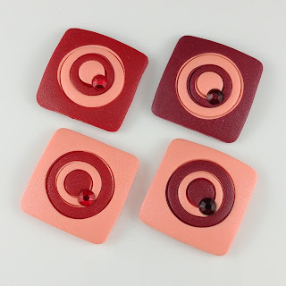
I combined these two shades with the Creme de Peche and Peach Pink to create some snaps for my interchangeable jewelry.  I love how the colors contrast yet combine so well.

Chili Pepper (left) and Biking Red (right) combined with Peach Pink
Chili Pepper (left) and Biking Red (right) combined with Creme de Peche

So here are the clay recipes for these two red using Kato Polyclay.  


Chili Pepper
6 parts Kato Red
1/2 part Kato Violet

Biking Red
2 parts Kato Red
1 part Kato Violet

* Note:  These clay color recipes are created using Kato clay.  Any of the base color "mixes" used are from my Clay Color System.


I will share more of the clay recipes with you tomorrow and over the next few days along with the index cards for you to print out and add your color chips to.

Thursday, August 15, 2019

Pantone Fall 2019 Fashion Colors

My sweet hubby Dave use to tell me that time was my worst enemy.  That was so true and it seems I am always trying to beat the clock when I have deadlines to meet.  I am sure many of you can relate to this as well.  Between filling orders, I am preparing some new pieces for the Lake Country Art Walk which is barely 3 weeks away.  Part of my new collection for this show is in the new Pantone fall colors.  I did promise to share with you these new clay recipes soon so here is the start:

The color of the year for 2019 is Living Coral.  You will find the clay recipe I shared with you in the spring 2019 color recipes here.
I really love the new fall colors.  Leatrice Eiseman (Executive Director of the Pantone Color Institute) describes them as "ranging from easy and sophisticated to strikingly different and unique". 


When mixing up my fall colors I like to make some extra color chips to play with.  They are a handy little tool when looking for various combinations.


So to start of the color recipes I thought I would start off with two colors that are from the same family as the Living Coral: Peach Pink and Crème de Pêche (a lighter version of the Peach Pink).

Peach Pink
1 part Kato Magenta
1 part Kato Orange
2 part Kato Yellow
12 parts White Mix #1-2 *


Creme de Peche
1 part Peach Pink (recipe above)
2 parts White Mix #1-2 *

* Note:  These clay color recipes are created using Kato clay.  Any of the base color "mixes" used are from my Clay Color System


Wednesday, July 31, 2019

Mixing up the Pantone Spring 2019 Fashion Colors . . . in a Snap!

I wrote this post over a month ago and realized I never posted it.  My life lately keeps getting interrupted with so many issues -- most of it is health related which I am currently working on.  In the meantime I keep trying to forge ahead and push myself as much as I can.

For the past few months I have been playing with color blocking using the Pantone Spring 2019 Fashion colors.  These were created using a simple and fun "cut and switch" method.  As I started mixing and matching the different colors, I kept finding more combinations which was almost addicting!  These are all mounted onto snaps for interchanging so they can be worn in various ways.


One of the colors used in these combinations wasn't from the Pantone Spring 2019 fashion color series but it coordinated with some of my new cork designs and mixed well with the other colors.  Can you guess which color it is?  It is a shade of turquoise I mixed up and I found it combined well with the Living Coral, Mango Mojito, Sweet Lilac and Eclipse. 

The Pantone Fashion colors are a great starting point for the season but that doesn't mean you have to limit yourself to those colors only and I wanted to share this with you as an example.


And of course I had to make some fun earrings to match.  To create these designs, I used the same method as my snaps and then fit them into the stainless steel posts.


So now that I am finally sharing this post with you, I am working on the new Pantone Fall colors.  I know we are only into mid-summer but I usually have the fall colors mixed by now as I need to be making pieces for my fall and winter collection.  So I will be sharing these new clay color recipes with you very soon!

Wednesday, April 24, 2019

New Faux Opal Colors for Spring

So I have been creating various items with the new faux opal colors that I purchased from Shades of Clay.  They are quite stunning and even though they seem a bit bright in the jar, the finished items have a much softer appearance.

Here are some snaps I made for my interchangeable jewelry and accessories using these new colors and the Art Resin.

Clockwise:  Aquamarine, Citrine, Pink Topaz, Peridot


When working with resins, I use the stainless steel blank snaps that have a flat base inside and a simple  bezel frame.  They are available in two sizes and I used the regular 18mm size for these.

And here are the stud/post earrings in the same colors using the stainless steel blanks.


And a few larger pendant pieces using the large metal charms (available in my online store here).
And here are some snaps I made using the Cabezel Molds where I used polymer clay for the Bezel and then filled the center with the faux Citrine Opal.  The yellow and green backgrounds really make the yellow in the opal mix pop more.  These pieces are also snaps for adding to any items with a snap base for interchanging.


Interchangeable shawl/hair pins with snap base
One thing I didn't realize is when working with the faux opals and Art Resin, there is a quite a different in the finished appearance of the pieces when using either Method A or B I show in my previous blog post here.  Scroll down to the very bottom to see the update report that I posted.

Charm on the left I used Method B and the Charm on the right I used Method A