Pages

Sunday, October 22, 2023

Introducing the new Revised Edition and Sale

I am happy to announce I finally finished the revised edition to my Clay Color System tutorial.  My original tutorial was first published 12 years ago (2011).  It is my own concept that I had been using for several years before that.

My original Color System tutorial was first based on Kato clay.  At that time, it was the only brand that was made in the true artist colors.  Previous to that, Premo (Sculpey brand) also had the true artist colors, but made the huge mistake of discontinuing them.  This created quite an uproar within the polymer clay artist community, so Sculpey decided to put back some of the colors into circulation -- but only the three primary colors -- Red, Yellow and Blue.  When the Sculpey company did this, a lot of clay artists jumped ship and switched to Kato clay.

While I personally like working with Kato clay, many artists find it difficult to condition (it is very hard/firm) and many have issues with the smell.  For me, it had become more difficult to obtain here in Canada as the shipping charges and extra import fees are horrendous.  And in the last few years, other clay brands that are made in the true artist colors have become more widely available, like Cernit (Number One series) and Fimo Professional (Not Fimo soft). 

I have tried Fimo Professional and find it quite nice to work with, however it does have it's issues.  For instance I like to make impressions in my clay which requires a mold release.  I generally prefer to use water instead of cornstarch.  Fimo clay reacts to water and becomes sticky and gummy.  If you would like to apply any type of powders to your textured clay, after using cornstarch as a mold release, any colored powders will not stick.


Since a year ago, I started experimenting with the Cernit brand clay and discovered how much I like it.  Not only are the colors true (Number One series) and vibrant, it is soft enough to work with without being too soft or sticky.  I also have all the colors in the Metallic, Pearl and Translucent.  Other than the Number One series, I love the Metallic the most.  The colors are just so scrumptious!  I am also intrigued with the Translucent as I have seen some amazing faux glass pieces created by other artists.


So in my last blog post, I announced that the Pantone color recipes would be the last I would be sharing with you here as I will be no longer using Kato clay.  You might be wondering about what will be next.  Any future recipes will be available in my online store and I will be sharing here inspiration on using those new colors.


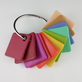
The new Revised Edition of my Clay Color System was revamped to work with other brand clays besides Kato.  It does not have all the extra color recipes provided in my Original Clay Color System that uses Kato clay but these recipes can be purchased separately or as an extra bonus.  Many of these recipes are used as base colors to create the Pantone color recipes provided on this blog (see the link at the top of this page).  This means you can still create the older color recipes provided here using other clay brands besides Kato, but the end results might not be the same.

So if you do not have my Clay Color System and would like to learn more about an easy way of mixing color, I have it on sale (30% off until the end of this week.  To celebrate finishing my work, I decided to put all my other tutorials on sale for 30% off as well (excluding my snap tutorial with the bonus Starter packs).  No coupon code is necessary.  The prices have already been reduced.  The sale will end on midnight next Saturday, October 28.

* Also my preprinted color recipe cards will be available soon - as soon as my materials arrive.  I will keep you up to date on this.

Friday, October 20, 2023

Summary for the Pantone Fall 2023 Fashion Color Recipes

Here is a review of the Pantone Fall 2023 Fashion Color Recipes.  Click on the photos below to see the individual recipes.  You can access the past Pantone seasonal color recipes by clicking on the tab at the top of this blog.  I have my Pantone color recipes posted on this blog that go all the way back to 2011 when I first published my Color System tutorial.  I have been mixing up Pantone colors using Kato clay much longer than that and always found it to be inspiring and a way to spring board my creativity each season. 

Now I feel it is time for a change and so sadly, this was the last time I will be sharing any future Pantone color recipes here on this blog.  You will be able to purchase any new designer colors through my online store in future and I will be sharing here instead ideas on using these new colors.

Viva Magenta - Color of the Year

Red Dahlia - Red Orange - Burnt Sienna - Rose Violet

Carnival Glass - Kohlrabi - High Visibility

Persian Jewel - Tender Peach - Doe

I hope you enjoy these new recipes.  I will be sharing shortly some finished items made in some of these colors.  To see more samples, you can see my work in my online store in the Shop by Color Category.

Friday, October 6, 2023

Pantone Fall 2023 Fashion Colors Persian Jewel, Tender Peach & Doe

I will be sharing the clay recipes for the last three Pantone Fall 2023 fashion colors, Persian Jewel, Tender Peach and Doe.  Doe is a actually one of the Classic Neutrals that I decided to include.

Persian Jewel is a gorgeous blue with a hint of violet yet slightly muted.  Pantone says it is inspired by the precious stone, lapis lazuli.  I really love this color and find it to be very calming.  I would love to have a top or outfit in this color but might just settle for some new clay jewelry instead!

Tender Peach is a soft yet peachy beige with a slight pink flesh undertone.  I think it would combine well with the Persian Jewel or even the Burnt Sienna.  I will have to experiment and see.

Doe is a soft brown with a rich gold undertone and perfect for fall.  It definitely is a great Classic Neutral and thinking animal prints.


Persian Jewel
2 parts Ultramarine #9-2 *
1 part Kato Silver
1/4 part Kato Violet
3 parts White Mix #1-2 *

Tender Peach
8 parts Kato Beige
1 part White Mix #1-2 *

Doe
4 parts Kato Gold
2 parts Kato Silver
4 parts Ecru Mix #2-8 *

* Note: These base color mixes are found in my Clay Color System Tutorial

I haven't had the time to play with these color yet as I am working on my new revised edition to my Clay Color System.  So far I am on schedule to have it published next week.

It is Thanksgiving weekend here in Canada so to all fellow Canadians, Happy Thanksgiving!

Thursday, October 5, 2023

Pantone Fall 2023 Fashion Colors Carnival Glass, Kohlrabi, and High Visibility

The Pantone Fall 2023 fashion colors include two shades of green -- one is a mint and the other a more yellow green.

Carnival Glass is the minty shade of green and does have, as Pantone describes, an icy appearance.  While this shade of green is particularly not my favorite, it could look nice when combined with another color such as navy blue.  I will have to experiment and see what I can come up with.

Kohlrabi is a warmer green and while similar to the brighter color, Love Bird, from this year's spring collection, it is slightly muted with a gold undertone.  This is my favorite shade of green that I always tend to be drawn to and can't seem to resist.

High Visibility is a very close match to Empire Yellow, which was also one of this year's spring palette.  It is also very similar to the yellow, Meadowlark, used in the Spring 2018 Pantone collection.  There might be a slight difference between each of these yellows, but it is so slight, one can hardly notice.  It is also on Pantone's list for a "close match" so this is why I chose to use the same color recipe again for this fall.


The only items I have made with the Pantone Fall colors for this year so far are a few of my little textured buttons.  Here are some in the High Visibility (Meadowlark) and Kohlrabi.  These, along with a wide assortment of other colors are available at the Kelowna Yarn & Needlecrafts store.


So here are the recipes for these three colors using Kato clay:

Carnival Glass
2 parts Kato Green
1/2 part Cilantro # 7-3 *
10 parts White Mix # 1-2 *

Kohlrabi
10 parts Kato Yellow
1-1/2 parts Kato Green
1/2 part Kato Gold
3 parts White Mix # 1-2 *

High Visibility

* Note: These base color mixes are found in my Clay Color System Tutorial 

Wednesday, October 4, 2023

Pantone Fall 2023 Fashion Colors Red Dahlia, Red Orange, Burnt Sienna & Rose Violet

While most of the Pantone Fall Fashion colors for 2023-2024 tend to be somewhat bright they all still have slight earthy undertones.

Besides Viva Magenta, there are 4 other colors in the red or magenta specter.  I will share the clay recipes for these with you today.

Red Dahlia is a rich wine red and is a very close match to the Pantone Fall 2019 color Chili Pepper so I am using the exact same recipe again.  This clay color may appear light after mixing but you will find it to become darker after it is baked.  That is one of things I noticed with using Kato Brand Clay, especially when working with red, magenta and sometimes violet if added as an ingredient. I have learned to make an allowance for this when mixing my colors.  I am currently working out some of these recipes with other clay brands, particularly Cernit, to see if I get the same results.


Red Orange is not exactly as it sounds.  It is in fact a more orange shade of red as compared to the swatch shown on a computer screen.  

Burnt Sienna is an earthy rust red that reminds me of autumn leaves.


Rose Violet was a Pantone Fashion color from last year - Fall 2022 - 2023.  It is gorgeous fuchsia and combines quite nicely with this years fall palette.  


Here are some pieces I made with the Rose Violet last fall that I screen printed in white.

Interchangeable Earring Beads in Rose Violet

Large interchangeable snap in Rose Violet

I still haven't had time to make much with these new colors yet but need to get cracking!  So in the meantime I will share these recipes with you so that you can start mixing them up as well.  So here are the four recipes using Kato Clay.
Red Dahlia
6 parts Kato Red
1/2 part Kato Violet

Red Orange
1 part Kato Orange
1/4 part Kato Red

Burnt Sienna
4 parts Kato Red
1 part Kato Magenta
1 part Kato Gold

Rose Violet
3 parts Kato Magenta
1/2 part Kato Violet
1 part White Mix # 1-2 *

* Note: These base color mixes are found in my Clay Color System Tutorial.

My Clay Color System tutorial is based on using Kato clay. If you like to work with other clays, (Cernit, Fimo Professional, Premo, etc.) my revised edition will be available very soon and I will have a special introductory sale price for it then -- (next week).  I will be announcing it here and on my facebook page when it is ready.