Pages

Friday, August 30, 2013

Pantone Fall 2013 Fashion Colors Turbulence and Carafe

Here are the last two clay recipes for the Pantone Fall 2013 colors Turbulence and Carafe.  While I consider these two colors more as "neutrals" rather than actual colors, they can be used as an accent with many of the other Pantone Fall shades.  I do like how they combine to give the classic look found in this Pantone sketch.
When we are creating with our clay, we do not have to limit ourselves to the clay mixture itself to obtain the Pantone colors that are in season.  For instance, inks, paints or mica powders can be applied to the clay to achieve the same results.  This button for instance is a combination of pearl and antique copper mica powders applied to black clay that was textured, resulting in a very close match to the shades of Turbulence and Carafe.


Here are the clay color recipes using Kato clay:

Turbulence

1 part Charcoal Mix #1-9 *
1 part White Mix #1-2 *

Carafe

6 parts Burnt Umber Mix #3-2 *
1 part Kato Black
1/2 part Kato Gold

*Note: These base color mixes are found in my Clay Color System Tutorial.


Just a reminder that my Clay Color System Tutorial is still on sale for half price until tomorrow (Saturday night).  Even if you do not use Kato clay, my color system is more than just color recipes. It is all about mixing up colors as well as creating blends and then a simple method for keeping it all organized.

Thursday, August 29, 2013

Pantone Fall 2013 Fashion Color Samba

The Pantone color Samba is a rich and very vibrant shade of red.  Years ago we have never found jewelry pieces in red to be big sellers.  We have noticed, however, that over the past 2 years, red has gained more popularity and now almost any item we create in red sells and we get more requests for items in red than ever before.


Combining red with black can be very dramatic.  Here are two scarf clips created with the Samba red. The one on the left is red on a black background using the "sutton slice" technique and the one on the right is charcoal mica powder on the Samba red textured clay.


Here is the clay color recipe using Kato clay:

Samba

3 parts Kato Red
1 part Kato Magenta


Tuesday, August 27, 2013

Pantone Fall 2013 Fashion Color Mykonos Blue

I love the rich shade of the Mykonos Blue that has a deep teal undertone and is named after the beautiful waters surrounding the Greek Island.

I am imagining this color combined with several other Pantone Fall colors like Acai or Linden Green.
Here are a few floral shawl/hair sticks in this lovely shade of blue.


And the recipe for Mykonos Blue using Kato clay:

Mykonos Blue

2 parts Kato Ultra Blue
2 parts Kato Turquoise
1 part Kato Green
1 part Kato Pearl (optional)

Note:  The pearl in this recipe is optional but I find it adds that little bit of shimmer making the color appear richer.


Monday, August 26, 2013

Pantone Fall 2013 Fashion Color Koi

The Pantone fall 2013 color Koi is a deep orange similar to the color of goldfish in a pond.  When selling our jewelry we have found orange to be a color that people are either not crazy about or just love.   I generally like to use orange within a design as opposed to a stand alone color.
When we make our flowers, however, it is another story as we find it is one of our top sellers. These flower beads were made using the Pantone color Koi combined with the two yellow greens, Linden and Deep Lichen.


Here is the color recipe using Kato clay:

Koi

6 parts Kato Orange
1 part Kato Red
1 part Kato Gold
2 parts White Mix #1-2 *

*Note: This base color mix is found in my Clay Color System Tutorial.

Sunday, August 25, 2013

Pantone Fall 2013 Fashion Colors and Carolyn's Clay Color System

I've gained a lot more followers over the past few years since I first introduced my Clay Color System and I realize many of you might not be familiar.  As a continuation of my tutorial, I have been sharing with you my color recipes for the Spring and Fall Pantone Fashion Reports using Kato clay.  You can see links to past color recipes I have posted on the above tab of this blog, titled, "Polymer clay color recipes & tips".

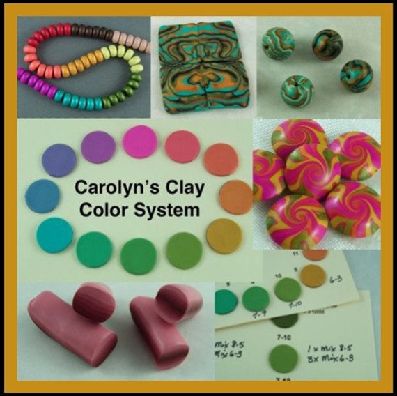
My Clay Color System is a simple method to learn how to mix and combine color as well as organizing those color samples and even your clay.  It includes over 50 of my own color recipes, some of which are "base mixes" for creating shades or tints to get you started on your way to creating new colors of your own.


You can purchase my tutorial as an instant download in our Etsy Shop.

or in our online store -- (you will have to wait for it to be e-mailed to you).

Pantone Fall 2013 Fashion Colors Deep Lichen Green and Linden Green

Shades of olive or lime are my absolute favorites and the color I look best in as I've been told they bring out the green in my eyes.  Two of the Pantone Fall 2013 colors are Deep Lichen Green which has a rich mossy tone and Linden Green, a yellow green that (as described by Pantone) "brings a lightness and brightness to the deeper shades of fall".


I find these two greens compliment each other quite nicely as you can see in these "leaf beads" I made from a skinner blend of the two to use in our fall jewelry designs.


Here are the clay recipes for these two greens using Kato clay:

Deep Lichen Green

2 parts Kato Turquoise
1 part Kato Gold
1 part Black Mix #1-8 *

Linden Green

10 parts Kato Yellow
1/2 part Kato Green
1/2 part Kato Gold
4 parts White Mix #1-2 *

*Note: The recipe for these base mixes are found in my Clay Color System Tutorial.

Friday, August 23, 2013

Pantone Fall 2013 Fashion Colors Acai and Vivacious

I thought I would start you off with clay recipes for two of the new Pantone Fall 2013 fashion colors, Acai, a deep purple and Vivacious, a rich fuchsia or magenta.  The two colors go really well together so make a great combination in the clay.  Purple is one of those colors that does not look good on me, no matter what shade.  I have learned, however, that when you are making jewelry and other accessories to sell, you need to consider the buyer and so we include this color in our work more as there are many purple lovers out there.
This is a bargello style scarf clip in the Acai and Vivacious color combo.


And here are the recipes for these two colors using Kato clay:

Acai
5 parts Mix #10-2 *
1 part Kato Silver

Vivacious:
10 parts Kato Magenta
1 part Kato Red
1 part White Mix #1-2*

*Note: These base color mixes are found in my Clay Color System Tutorial.

Wednesday, August 21, 2013

Pantone Fall 2013 Fashion Colors and Emerald Color of the Year

I just realized how August is already more than half over and it is time to be thinking about fall colors already.  Pantone determines the fashion colors for each season and shares them in their Fashion Color Report.  I've been busy mixing these new colors up using the Kato Poly Clay and will share my new clay color recipes with you over the next week.


As I was mixing up the new colors I could imagine all sorts of various combinations.  I find the mixing process gives me the jumpstart I need for the next season.  If you like to make jewelry to sell or even for yourself, it is great to keep up with the current fashion colors so you or your customers will have something to go with that new blouse or dress they just bought.

Check out the video (click here) where Leatrice Eiseman, the Executive Director of the Pantone Color Institute, talks about and describes these new fall colors.

To start you off, I already shared the clay color recipe for Emerald which is the Pantone fashion color of the year.  If you click on the photo below, it will take you to the blog post with the recipe using Kato clay.


Sunday, August 18, 2013

More Radiating Lines Kite Beads and Matching Earrings

I made more beads in different color variations of the Radiating Lines style necklace I showed you in my last blog post (click here to see).  I learned how to make my own texture plate to create these kite style beads from Helen Breil's "Radiating Lines" tutorial.  They are not put together yet but are added to our "finishing" bead pile to be put together later.  They should be finished in time for the Lake Country Art Walk along with more new creations we are working on.

copper and teal kite bead set
oil slick kite bead set
Here are some earring pieces I created to go with the above beads and the necklace I showed you last.


Wednesday, August 14, 2013

Radiating Lines Necklace and Lake Country Art Walk

We are really excited about being in the Lake Country Art Walk this September.  It is a real impressive show with more than 300 artists represented.  It is a nice place to spend the day and even relax in the courtyard for a snack or lunch and enjoy some great live music.

We will have a wide range of scarf jewelry and accessories available with many other items including our popular interchangeable art bead earring system.

I haven't posted any jewelry pieces lately and thought I would show you one of my favorites.  I made this one a while ago for myself to coordinate with the vintage jacket Dave bought for my birthday last year.  It consists of four "kite"beads with a large focal in the center.  It is textured using my own plate that I designed and created based on Helen Breil's "Radiating lines" tutorial.


To learn how to make your own kite beads as well as other free tutorials available on my blog, click on the "free tutorials" tab at the top of this blog.

Thursday, August 8, 2013

More Clay Play Time & the Future

It has been really nice to have a new clay friend to spend some time with.  Denyse and her daughter Shaunna have been like sponges lately, wanting to absorb anything they can learn and I find that their enthusiasm is contagious and is such a joy to be around.  We played with our extruders the one day and I asked Denyse what she wanted to learn next and she told me she really wanted to learn how to make flowers and cane construction.

We started with a review on making another skinner blend for our flowers and then created two styles of flower canes using the same blend.  We then made a bulls-eye lace cane for our flower centers and then created a floral design.  We ran out of time so Denyse and Shaunna took their flowers home to be baked and we will make something from them the next time we clay together.  The two flowers on top were both made with Kato clay which Denyse has decided to use for future after playing with it as well as Premo.


Shaunna prefers to work with the Premo clay but even with air conditioning, the clay was so soft we had to put her canes in the fridge to chill as they were a little soft and mushy.  That is one of the reasons she found forming her flower a little more challenging so she might have to get use to leaching her clay as it will be easier to work with.

Denyse finished her fused glass wind chimes and sent me a photo of it so I could share it with you.  She incorporated some of her clay beads she made the first time we clayed together (you can see them here) and they just blend beautifully with her design.  They are towards the bottom of each dangle above the large glass pieces.  Isn't this piece really cool?


We also discovered something that I need to share with you all.  After 6+ years, our supply of Future Acrylic Floor finish was finally running low and we needed more.  Since Denyse needed some for herself as well, she managed to pick up a new bottle to share but we had noticed that not only the label has changed, so has the name -- again.  It use to be called Future Floor Finish then changed to Pledge with Future and now it is just called Pledge Floor Care.


The bottle on the left is my old original bottle and the one on the right is the new product.
There is no mention of Future anywhere on the bottle so we wanted to be sure it was the same product. Then Denyse pointed out the UPC codes which is exactly the same on both bottles.


This means they are the same but could really cause some confusion for anyone out there looking for this product.  I hope this helps and we can spread the work in case others are having a difficult time finding the right stuff.

Tuesday, August 6, 2013

A Twist of Yarn

Some of the stores that sell our products are not traditional stores at all.  One of them is an adorable yarn shop set in an historic heritage home in downtown Vernon, BC.  It has been lovingly restored by Camella and her family right down to the hardwood floors and stone fireplace.


Camella is a great knitter, but as you can tell from these photos, she also has a green thumb!


Besides carrying a variety of our buttons and shawl pins, A Twist of Yarn now carries a good selection of our hottest new innovation - scarf jewelry.


Sunday, August 4, 2013

Concave Textured Buttons

These are some new buttons with a deep texture and concave shape.  They are quite large (2-1/4") and go great on a quilted or felted bag.  Both the round and the leaf design were created using a texture plate designed by my friend. Helen Breil, called Fandango which is one of my absolute favorites.  Mica and paint pigment powders are then applied to the raw textured clay before baking.


These buttons are our a few of our new styles for fall and are already making their way into many of the stores that sell our work.  We created some in custom colors to go with a new fabric line at The Sewing Basket in Salmon Arm.